


Adopting the design thinking process, I redefined and solved problems, identified alternative strategies, and created innovative solutions while focusing on user needs and behaviors.

Survey
User research
Competitive analysis
SWOT


Problem & Goal
Personas
Empathy Map
Journey Map

How Might We
Brainstorming
User Flow

Wireframes
Visual Design
Info Architecture
Prototype
Survey
User research
Competitive analysis
SWOT
Problem & Goal
Personas
Empathy Map
Journey Map
How Might We
Card Sorting
Brainstorming
User Flow
Low-Fi Wireframes
Visual Design
High-Fi Wireframes
Prototype

Usability Study
Feedback Iterations
Conclusion
Future Concepts


UX & UI Designer
UX Researcher
10 weeks
To learn what secondary research data is available I leaned on statistics, quantitate surveys, and Baymard research articles. Evaluating insights, I strategized the order of menu categories, flavors, and dietary preferences. Data further indicated evident cross-purchase consumer behaviors revealing opportunities to increase order value.
of users who buy popcorn also buy candy
of users prefer butter flavor, 16% white cheese, 16% Caramel Corn
of moviegoers who buy candy also buy popcorn (89%) and soda (85%)
of the most popular concessions are popcorn, 33% soda, 12% candy, and 5% ICEEs
20% of U.S. adults follow a low-carb/no-carb diet, 10% Lactose-free, 9% Gluten-free, 5% Vegetarian, 4% Pescatarian, and 3% Vegan
of guests prefer M&M’s as their candy of choice when combined with popcorn, followed by Reese’s Pieces 16%
of users who selected M&Ms as their candy 36% purchased at least popcorn, and 44% visited the concession stand every time.
of shares are led by Coke, and 9% by Diet Coke. 2022 top flavors: Coke, Pepsi, Sprite, Dr. Pepper, Mountain Dew, and Fanta
of those over 51 purchase at least one of the top four items, with popcorn being the most popular.


ReferencesEvans, Lee. “Snack Statistic Findings Reveals Moviegoers Concession Preferences.” SurveyMe, 2018, www.survey-me.com/hubfs/SurveyMe%20NAC%202018%20Presentation-compressed.pdf.
Richter, Felix. “American Diets.” Statista Infographics, 23 July 2021, www.statista.com/chart/24791/share-of-americans-who-who-follow-nutritional-rules.
National Today Data Science Team. “Popcorn Eating Traditions.” National Today, 17 Jan. 2022, www.bakeryandsnacks.com/Article/2019/01/17/The-popcorn-of-all-ages-By-volume-America-s-most-popular-snack-video.
“Non Alcoholic Drinks | Brand Value Ranking League Table.” Brandirectory, 2022, brandirectory.com/rankings/soft-drinks.Beverage Digest.
“Energy Drink Sales Power up While Soda Fizzles.” Natural Products Insider, 30 Aug. 2013, www.naturalproductsinsider.com/beverages/energy-drink-sales-power-while-soda-fizzles.
Next, I wanted to learn about Baymards user research findings to optimize forms design for max clarity, speed, and completion rate.
.webp)
1. Inline success validation
2. Inline error validation
3. Password clue guide validation
4. Inline guide validation (what is placed inside the form)
5. Explain why you’re collecting phone number
6. Include hide/view password
1. Limit the number of forms, combine first and last names into “Full Name”; hide address line 2 and make it optional to add. Use zip code to auto-fill city and state
2. Avoid formatting forms in multiple columns.
3. Okay to have multiple inline forms if they are generally thought of as linearly (ex. dates, credit card info, first/middle/last name, etc.)
.webp)
.webp)
1. Auto-format credit card spacing
2. Auto-format phone number spacing with placeholder guide mask
3. Auto-fill recognize address input
4. Auto-fill city and state based on zip code
1. Auto-format credit card spaces and auto-detect credit card and input icon
2. Do not display credit card icons, in confusion users think they must select them
3. Do not use month names (Jan, January, Jan 03, January 03). Do not use single digit ex. 3 i/o 03
4. Do not use four-digit year ex. 2024, use 24.
5. Format expiration should be formatted exactly how it looks on the credit card; if utilizing a type-in form keep it short and include MM/YY for type guidance.
6. Include security badges
7. Hide coupon and promo forms into the dropdown
.webp)
ReferencesHolst, C. (2016, September 26). Usability Testing of Inline Form Validation: 40% Don’t Have It, 20% Get It Wrong – Articles –. Baymard Institute. https://baymard.com/blog/inline-form-validation
Holst, C. (2017, January 11). The ‘Credit Card Number’ Field Must Allow and Auto-Format Spaces (80% Don’t) – Articles –. Baymard Institute. https://baymard.com/blog/credit-card-field-auto-format-spaces
Holst, C. (2021, October 19). Checkout Optimization: 5 Ways to Minimize Form Fields in Checkout – Articles –. Baymard Institute. https://baymard.com/blog/checkout-flow-average-form-fields
Holst, J. (2012, November 5). Add Descriptions To Checkout Form Labels (92% Get It Wrong) – Articles –. Baymard Institute. https://baymard.com/blog/checkout-form-field-descriptions
Hugo, R. (2020, June 30). 5 ‘Credit Card Form’ Implementations That Make ‘L.L. Bean’ Best-in-Class – Articles –. Baymard Institute. https://baymard.com/blog/credit-card-form-ux-llbean
Scott, E. (2017, November 27). Consider Using Localized Input Masks for ‘Phone’ and Other Restricted Inputs (64% Aren’t Taking Advantage of Input Masking) – Articles –. Baymard Institute. https://baymard.com/blog/input-masking-form-field
Scott, E. (2018, September 17). Form Field Usability: Avoid Multi-Column Layouts (13% Make This Form Usability Mistake) – Articles –. Baymard Institute. https://baymard.com/blog/avoid-multi-column-forms
Scott, E. (2018, October 18). Format the ‘Expiration Date’ Fields Exactly the Same as the Physical Credit Card (90% Get It Wrong) – Articles –. Baymard Institute. https://baymard.com/blog/how-to-format-expiration-date-fields
To enhance product user experience and business value, I conducted a competitive analysis to develop a successful UX strategy, identify opportunities and gain insights into competitors' strengths and weaknesses.


1. Poor and unclear information hierarchy across most apps
2. No third-party login/sign-up options on any of the apps
3. Unclear sign-up placement
4. Unnecessary lengthy sign-up process


1. The menu is either hidden within other navigation or impossible to spot, contributing to a dead-end experience


1. No ability to search or filter the menu
2. Overly sub-truncated menu instead of dynamic info with size buttons
3. Poor visual design and mangled hierarchy
1. Includes:
• No size controls within PDP
• No nutritional data
• No allergens information
2. No pre-selected flavor that would typically be included, requiring extra clicks
3. No ability to select multiple drink flavors


1. No product descriptions
2. No product pricing
3. No customizations of any kind, size controls, nutritional data, or allergens information
1. Timer (poor accessibility)
2. No ability to edit the order in the cart (common)
3. Leaving app/menu/cart leads to order progress loss


1. Credit card icons are confusing (users click on them thinking they have to, best greyed out or hidden)
2. No error proofing of any kind, ability to scan credit cards, or use third-party payment
3. Poor contrast ratio in dark mode
4. No credit card icon upon input
5. No inline error validation
6. Unnecessary long forms
Detailed observations revealed areas of opportunity and common problems users encounter. There was not one pleasant user-friendly food ordering experience; most lacked basic features like order customization, product images, description, search, filter, and saving order progress.
To visualize similarities and differences between competitors' product features and services, I created a comparison matrix.

To identify gaps in the market, potential problems to solve, uncover market trends, understand internal weaknesses and external threats and turn them into opportunities, I mapped the data into a fact-based SWOT analysis.
• Loyalty and rewards program
• Freshly prepared food and the best in-theater dining experience
• Reclining chairs and comfortable experience
• American grill specialty food menu
• Full-service bar
• Delivery to seat service
• Custom luxury recliners, 100% reserved seating
• Modern lounge
• Food and drink menu available online
• No ability to order online or through the app
• No available menu within the app
• Inconsistent poor cross-platform branding
• Confusing website and app UI
• Poor information hierarchy, visual identity, and branding; inconsistent cross-device experience
• No 3rd party payment methods
• Poor accessibility
• Order delivery to seat
• Order customization
• Refund, out-of-stock, replacements customizations
• User-friendly intuitive UI, functional user experience like search, filter, re-order, etc.
• Live order tracking
• Easy checkout - 3rd party and scan card auto-fill
• Efficient re-order of favorites/Buy again
• Quick order/checkout
• Accessibility improvements
• Nutritional information
• Order customization
• Ability to order online or through an app
• 3rd party payment methods
• Product photos and descriptions
• Custom order pick-up time
• Guest checkout
• Compelling and memorable branding
• Promo codes and deals
• Custom pick-up times
• Stronger branding
• Loyalty/Rewards programs
To observe patterns and similarities in our potential user’s behaviors and needs, I conducted a user survey with over 300 responders. The quantitive research results revealed features that are essential to our target audience. I also included an open-ended allowing the user to add additional thoughts like additional features to consider.
of users selected as “Very Important /Somewhat Important” to have the ability to search the food menu
of users selected as “Very Important/
Somewhat Important” to have the ability to edit order with ease
of users responded as “Very Important/ Somewhat Important” to have the ability to customize food preferences
of users responded as “Very Important/ Somewhat Important” to have alternate sign-in/sign-up methods
of users selected as “Very Important/ Somewhat Important” to have light and dark mode
of users responded as “Very Important/ Somewhat Important” to have accessibility controls
of users selected “Very Important/
Somewhat Important” to have the ability to scan credit cards for fast auto-fill
of users selected as “Very Important/
Somewhat Important” to have SMS tracking notifications.
of users selected as “Very Important/ Somewhat Important” to have the ability to apply promo codes, 67% rewards
of users said creating an account would deter them from using the app
of users selected as “Very Important/
Somewhat Important” to have the ability to build bundles
of users said a complicated process would deter them from using the app
Features users suggested:
• One-touch ordering
• Themed bundles based on movies you’re seeing
• Countdown to when the movie is about to start, after ads and trailers
• Rewards system - earning points for free concessions
• Filters by type of food/drink for easy navigation
• Calorie information
• Language controls
• Save preferred orders
• Quick combos to order with one click
• Delivery, scheduling/pre-orders
• Product images and descriptions
• Delivery to seat
To make a useful product I needed to dive deeper into user needs and identify pain points. I completed remote user interviews with five target customers over Google Meet. With their permission, I recorded sessions and transcribed the interviews. I designed open-ended questions and prompted each user to read the questions individually aloud to ensure comprehension.
Survey objectives:
• Understand common user problems and how to resolve them
• Uncover common user behaviors, journeys, and expectations
• Determine what features users require
Survey questions:
1. Think about a time you went to a movie theatre and purchased food and snacks. Tell me about that experience
2. Tell me about issues or frustrations you faced during this experience, is there anything that could have made the experience easier or better?
3. Tell me what made past food/snack ordering experiences memorable or pleasurable?
4. What do you consider most important when deciding what food to order at a movie theatre?
5. Think about the times you’ve ordered food, how did you determine what food or snacks to buy?
6. When ordering your food, what special requests do you make or have you made in the past? Any that come to mind?
7. Tell me about the various reasons why you don’t order food at a movie theatre?
8. Tell me about any past experiences when you spent the most amount of money at a movie theatre on food and snacks?
9. What are the things most important to you when ordering food from an app?
I also asked quantitive questions to understand user demographic and needs:
1. How frequently before the pandemic did you go to the movie theatre?
2. On average when do you typically order food/snacks at a theatre?
3. How frequently do you buy food at a movie theatre?
4. If you had placed an order from an app - what would be your preference for receiving your food?
5. What fee would you find acceptable for hand delivery of your order to you?
6. How much on average do you spend on food at a movie theatre?
7. Age?
8. Education?
9. Income range?

“I want to be able to order food in the car on the way and pick it up before going in.”
“To me the most important is that the menu is easy to read and the check out process is easy”
“I don't go to any theater that doesn't have at least an app or better direct service.”
“Rapid pick up, quick start (no long drawn out on boarding process), easy menu”
“Ability to order as a guest without creating an account”
“The ability to view past orders so I can quickly reorder my family’s usual”
To define the problems our snack ordering app will solve, why it matters, and the results we seek to produce, I created problem and goal statements to guide the design process.
Moviegoers need a quick and easy way to order their favorite snacks and fully customize their order without standing in line or disturbing other patrons; their experience should be equivalent to or better than ordering from the counter.
Our snack ordering app will enable users to efficiently and effortlessly order and personalize their favorite snacks and drinks without the hassle of standing in line and the stress of missing their movie. Furthermore, it will include features that support an intuitive and expedient user experience. We will measure effectiveness by analyzing the orders placed and observing customer feedback.


After validating the target audience through user surveys and interviews, I created three user personas to represent the collective needs, frustrations, motivations, behaviors, and personalities of our users.

.svg)
There’s always a line and I feel awkward going by myself, if you have it on your phone it’s little bit less intimidating
Michelle is a nursing student living on a budget. She loves going to the movies to get a break from studying, and to get a break from people. Michelle is an introvert who orders her tickets and snacks online to avoid standing in line alone.
• Finds food expensive as a student on a budget • Has very specific preferences that most apps don’t accommodate • Introverted, wants to avoid lines
• Ability to save with promotions or bundles • Quickly order favorites • Full drink customizations • Avoid being alone


I am picky, I want all the customizations options there, like on Uber app
Missy is a single mother and medical coder who loves taking her son to the movies to get a break. There is no spending limit concerning keeping her child quiet and happy. As a single mother, she is always late and can not leave her seat to get food and snacks for the fear of her child being kidnapped or making him miss the movie.
• Leaving or dragging the child along to order food • No rewards for high spending • Inconsistent sizing across locations • Innacurate order estimate
• Order to seat to avoid dragging the child along to get more food • Avoid standing in lines • Convenient and fully customizable order experience


If I am late and I could just order without disturbing the person behind me and have it brought to my seat - it would be great!
Neal is a busy managing consultant, a married father of four, and a movie buff who never wants to miss any of the showings. Being late is the norm as a father of four; he reluctantly stands in line alone after arriving to ensure his wife and kids are happy and fed.
• Time is always an issue, he doesn’t have time to stand in line • Misses movie when getting food • Bright lights of other user phones
• Spend quality time with family • Quickest possible order experience • Ability to personalize order • Order without distracting others


To gain better insights into our users, and a deeper understanding of their behaviors, pain points, and needs, I developed individual and aggregated empathy maps to identify collective motives.
• “Timing is always an issue... so you’re always waiting in lines - it’s about having a quick service”
• “They have a fun soda machine, where you can press all the buttons and you can get a specific flavor. They don’t have that anywhere else.”
• “I am picky, I want all the [customizations] options there, like on Uber app”
• “I wouldn’t mind a fee. Delivery to seat would be ideal to make sure my kid isn’t being kidnapped”
• “If I could order without disturbing the person behind me (to my seat) - that would be great”
• Pick-up and delivery ordering experience should be convenient, with no line waits
• Timing is always an issue, wants snacks before the movie starts or delivered during
• Thinks the most pleasurable experience is a quick and expedient one
• Their food preferences require a lot of customization to be just right
• Order processing should be easy to understand and as quick as possible
• Extra usability features are a “need”
• Upon arrival to theatre almost always immediately goes to concessions, unless late to showing
• Orders the same things most visits
• Uses apps for movie tickets for convenience and to avoid standing in lines
• Has a lot of customizable food+drink preferences and special instructions
• Go to theatre to relax and escape from work, kids, and responsibilities
• Cost-conscious, purchases bundles and combos for savings
• Hates to wait in lines, wasting time
• Loves the convenience of being able to use an app for food and movie tickets
• Likes expedient experience, order quickly and get it quickly
• Loves dine-in theatre experience with extended food menu and alcohol choices
• Don’t like distractions of any kind during movie - like other patrons phones
• Doesn’t mind fees for to-seat or to-door delivery because it allows not missing the movie


To understand how we can improve the user experience, I created a visual representation of their journey and emotions as they interact with our product to achieve their goals.
After identifying design challenges through user research, I transformed these statements into “How Might We” questions to explore innovative ideas, reduce bias, and solve problems.
simplify the order process, and make it quicker?

add full order customizations and personalization?
simplify payment options and increase order completion?
make re-ordering favorites easier?
reduce noise and distractions of other patrons while user is using the app?
make online ordering experience better than in-person?
allow users to bundle to save?
To prioritize user needs and optimize their experience, I developed a user flow to identify steps users take to achieve their goals and potential roadblocks and dead-ends they may encounter.
.svg)

After collecting data and deciding which feature to prioritize, I created Information Architecture to define the overall content structure, helping users effortlessly navigate the app and find the information they need.
.svg)
.svg)
Harnessing user research findings and insights, I quickly iterate as many options as possible with Crazy 8's methodology. With low fidelity wireframes I established key features, functionality of the app and primary user journey.
%20copy.webp)
To create an immersive experience reminiscent of a theatre — neumorphic style was selected. User interviews and survey results revealed a clear need for both light and dark modes for in and out-of-theatre experiences. I created a design system with visual guidelines like color, typography, grid, and components for each light mode.
Proxima Nova font is a branded Adobe Font with similar characteristics to SMG’s logo typeface. The font renders well on high-resolution screens and mobile devices but contains limited language support. SMG Theatres are located exclusively within the United States, because of language limitations and in the interest of inclusive design, native fonts Roboto and SF Compact can be loaded if the user selects an unsupported language.
Bench Nine serves as the condensed accent font that renders in every language; minimally used throughout the design to create hierarchy, and conserve space; it is a google font chosen to replace existing branded font.


Key brand colors red and blue served as the palette foundation. Established dark and light mode color palettes using shades for a neumorphic-inspired design for an immersive style experience. Implemented gradient to mix brand colors with darker shades to meet WCAG 3.0 color contrast compliance for dark mode and WCAG 2.0 for light mode.

.svg)
.svg)
.svg)
Used auto layout and 12-column auto grid system with 16px margin, and 8px gutter to ensure responsiveness. Spacing between objects — 8px, 10px, 16px, 28px and 40px

These are system icons fitting within 24 x 24 px size bounds. I used a secondary active state with red fill for maximum color contrast against the dark background.
.svg)

.svg)
.svg)
A limited demonstration of low-level components built; the complete component library is exponential. Components and variants ensure cohesive design while accelerating workflow.
Developed components using Master components and Auto Layout for cross-device responsiveness; these features make changes effortless as each item automatically realigns itself. Adopted variant instances to create dark and light mode states from the master component, in addition to different activity and boolean states.
All buttons are above 48px creating more user-friendly and accessible navigation.


After refining low-fidelity iterations and user interface, I developed high-fidelity wireframes into an interactive prototype in Figma with custom animations built in After Effects and Lottie.
SM2.gif)


.gif)


To educate the user on the app's helpful features, I introduced animated onboarding screens with the option to skip. These included location finder activation for theatre pin, notification sign-up for up-to-date order notifications, intro to dark/light mode controls, accessing movie tickets, and signing up/in for rewards. Animations were limited to 3 seconds for accessibility.
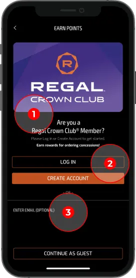
Upon selecting sign-up/sign-in, users are presented with alternative options such as SMS, email, social, native, or continue as a guest; surveys revealed users expect alternative sign-up/sign-in options, and the ability to continue as a guest is a must.


To familiarize the user with navigation controls and the app's unique features, I created a quick intro guide to explain dark and light modes, notifications location, and how to scan movie tickets for on-the-go access.


In the spirit of inclusivity, I wanted to design a UI that makes the app more accessible to all audiences. I included language, voice, and full accessibility controls. In addition, color contrast, font size, animations, and button size comply with WCAG 2.0 guidelines.


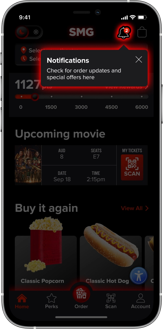
User interviews revealed features users cared about that I integrated into the app's homepage - buy again, rewards, deals, and primary categories they shop.
If the user logged in, they will see their upcoming movie tickets and Buy Again options first, allowing them to reorder favorites quickly. Included in the homepage design, are designated features for the cinema's gourmet dishes, and subscriber perks upsell.
.svg)
“I have learned as a parent that the candy options are bad for kids with a gluten allergy because gelatin has gluten in it; it's important for kids with allergies.”


The middle nav button leads to the primary menu categories. Features included - search, voice control menu search, and filter.
Within the filter, I wanted to include primary dietary restrictions based on research and the ability to browse by price since some users are price-conscious shoppers.


The search was designed following Baymard best practices, including recent searches and recommendations, and highlighted (bolded) search text. I added product images for quick identification.


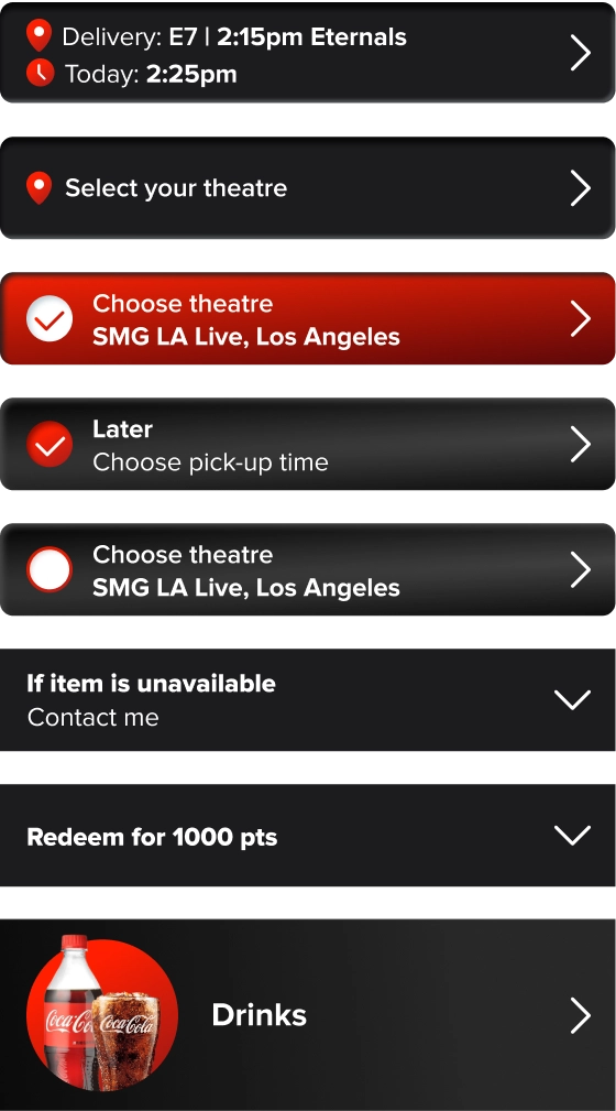
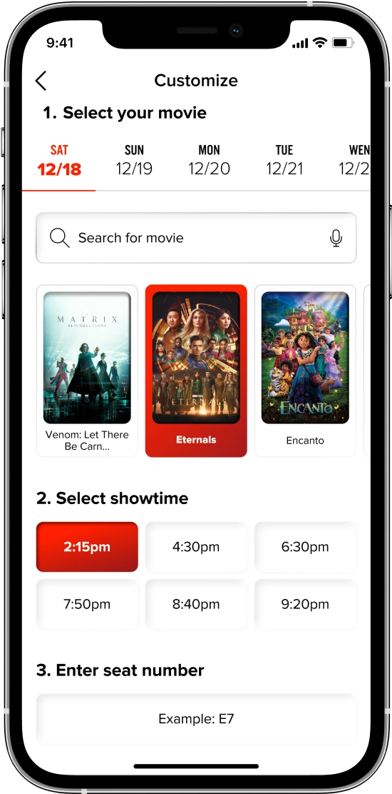
Whether the user starts their journey from the homepage, menu, or past orders, they are offered the choice of pick-up or delivery to seat. Upon selecting the method, if they are logged in, they are encouraged to auto-sync theatre, and seat data; if not logged in, they manually enter the information in the next step.
For max usability, I included features like use-my-location, map, and list view, voice control search, ability to favorite locations, view additional theatre information, and ability to sync data.


Upon selecting their theatre, if pick-up, it goes to a confirmation page to select pick-up time; if the user chooses delivery, and they are not signed in, they must search/select their movie, showing time, and seat number.
Upon completing seat selection, they pick a delivery time - now or later. If the user makes a mistake or changes their mind they can easily switch to the pick-up method from the same screen.
“I am picky, I want all the [customizations] options there, like on Uber app”


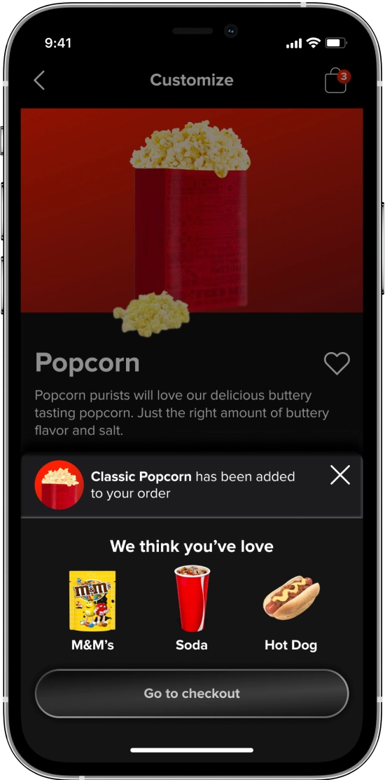
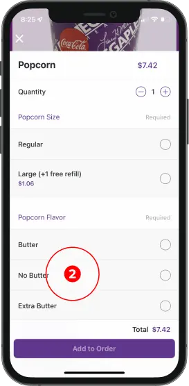
User interviews revealed the importance of customization; users enjoy mixing drink flavors, controlling the butter is placed on their popcorn, and so on. I wanted to provide users the same customization available at the counter.
Features include modifying existing ingredients, add-ons, bundle builders, and favoring an item. For users unfamiliar with the difference between sizes or those visiting locations under different ownership, I included ounces size information.
“Let's say something screws up in the movie theater, like the slushie machine is down, it should alert you through the app or refund it in the app.”


Users revealed issues they face when placing orders - like items being out of stock, popcorn machine being broken, etc. I wanted to give users control over what to do with their order if a problem occurs - giving them the choice of refund, replacement, contact, or cancel.
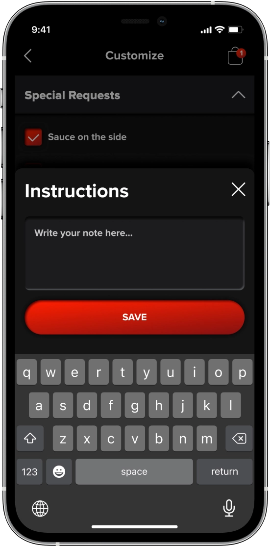
I included the ability to add notes and select special requests because not every customization can be addressed in the design.
Users stressed the importance of nutritional and allergy data in surveys so I built a nutritional and allergen chart screen.
“Have it be buildable, like a drink option or pretzel with popcorn, and make it less expensive”
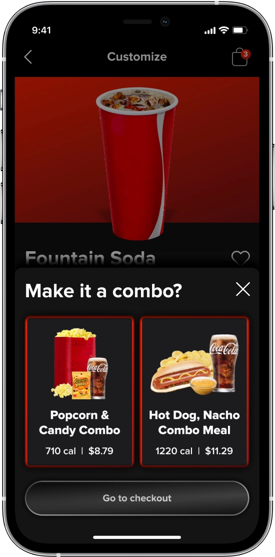


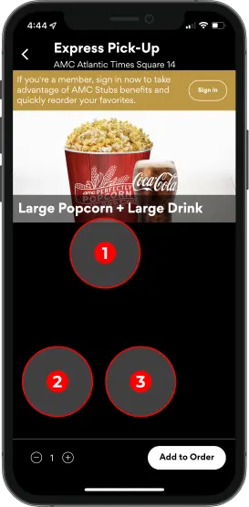
If a user adds a single item like a drink, they are presented with the option to build a bundle. After selecting their bundle and customizing their choices, the user confirms the bundle before adding it to the cart.


In the final steps, we have the cart. If the user opted to skip selecting theatre before, they are required to at this step before checking out.
Within the cart, the user can add more products, and edit or delete them. If the user deletes an item, they must confirm the deletion and are temporarily offered the opportunity to undo it.


Further down the checkout screen, users can add more items, select special requests, and add order notes.
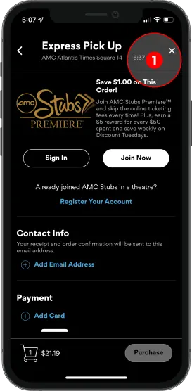
During interviews, users stressed the importance of a comparable experience to ordering at the counter; following Baymard’s best practices, I added the ability to add promo codes and rewards.


The final steps in the checkout include the option to add, edit and customize tips, add/edit payment, opt-in to text and push notifications, and Movie Pass subscription.


At checkout and account, the user can access their wallet. Within the wallet, they can find their cards, add a payment method, and apply gift cards and customer support credits. Surveys revealed third-party payments are the expected standard as an alternative payment method.
If a user chooses to add a credit card, I added the ability to scan credit cards for fast auto-fill and optimized payment forms based on Baymard's best practices research.


Once the user completes their order summary pop-up displays. Upon exit, it redirects them to the last page they ordered from, with a mini order track bar that appears on primary navigation screens.
Users expressed frustration with tracking orders, inaccuracy, and lack of details. I chose to provide order lead time and live tracking to reduce frustration.
“I like that you can earn points for buying things. It kind of feels like they care to give even a little bit back because you’re spending this money”


User interviews revealed the importance of loyalty rewards, especially within theatres. I displayed a points bar on the home, rewards, and account pages for ease of access. Within the rewards page, I wanted to feature both abilities to claim, view locked rewards, special deals, and savings, and earn bonus points encouraging users to engage with the brand.


Finally, within my main navigation, I included the ability easily scan upcoming movie tickets, and access account information and controls.
Within the account, I also included the ability to access accessibility controls if they were hidden.
“If I am late and I could just order without disturbing the person behind me and have it brought to my seat - it would be great... People use their cell phones in front of you and it's too bright, that's a big distraction.”
User interviews revealed the need for dark mode in order to reduce disturbing fellow patrons within the theatre, however, surveys also revealed the necessity of light mode. I created a design system that allowed me to build components for each mode simultaneously - set as variants for fast, and easy global updates across both modes.
To allow users to quickly switch between dark and light mode on the go, I included a switch button in the top left main navigation.


To convey design intention and finished product behavior, I created interactive prototype for early product testing.
Due to iOS/Figma embed issue, interactive prototype only works on desktop. InVision mobile prototype coming soon!
Due to iOS bug, you will need to upgrade to iOS 16 to view prototype in Figma Mirror without issues.
.webp)
.webp)
Tap/click once on the screen to view clickable, interactive elements.


