
Faced with the challenge of clearly communicating client rates, we envisioned a tool that goes beyond clarity.
It not only accurately depicts true costs, but offers incentives for larger investments through cost savings, ultimately empowering clients to make informed decisions about their financial journey with us.

A non-linear, iterative design thinking process was followed to understand users, challenge assumptions, define problems, and create innovative solutions to prototype and test.
.svg)
UXR Workshop
Usability Interviews
Affinity Map
Research Findings
.svg)

Problem & Goal User Personas Empathy Map

How Might We
Co-creation UXR
Design Iterations
Prototype

UXR Workshop Usability Interviews Research Findings Feedback Iteration

UX & UI Designer
UX Researcher
4 months
When I joined this new product team, I encountered a challenging landscape. Stakeholders were unfamiliar with UX principles, research was undervalued, and clear project objectives were lacking. Faced with low UX maturity, high resistance, and unclear goals, I took initiative to bridge the gap.
Recognizing the Need
A new researcher joined us, and stakeholders pressured them to use leading yes/no questions without proper strategy. This prompted me to propose a research alignment workshop.
The Workshop Template in Action
The workshop brought together a diverse group, including senior leadership, product owners, business analysts, tech leads, and the UX team. My workshop template facilitated a collaborative process:
Workshop Outcomes and Impact
This experience showcased the power of proactive initiative and well-designed workshops in driving UX maturity and fostering a collaborative research environment.

When I joined this new product team, I encountered a challenging landscape. Stakeholders were unfamiliar with UX principles, research was undervalued, and clear project objectives were lacking. Faced with low UX maturity, high resistance, and unclear goals, I took initiative to bridge the gap.
Pilot Research Objectives
Following our workshop, we established the following objectives for this pilot user research study:
Methodology Selection
To identify the most suitable user research methodologies, we reviewed the high-risk and high-uncertainty assumptions and questions identified during the workshop brainstorming session. Given the need to collect both quantitative and qualitative data, and the possibility of encountering users unfamiliar with the system, we determined a task-based usability interview incorporating the Think Aloud protocol as the optimal approach. This methodology would be complemented by open-ended, qualitative follow-up questions focused on core themes from the workshop: ease of use, functionality, perceived value, information architecture, user expectations, and future desires.
The design of the page necessitated an innovative approach to usability testing. To comprehensively evaluate multiple features without leading participants, we developed a single scenario encompassing various client options. Users were then asked to walk us through how they would utilize different aspects of the page to propose solutions tailored to those client options, followed by open-ended questions. This approach enabled us to gather non-leading feedback in a setting that closely mirrored real-world usage.
Example Task and Follow-Up Questions
Scenario:
Your client has the following available to use towards this holdings plan:
Follow-up Questions:
Participant Recruitment
We recruited six participants for the study, excluding two subject matter experts with whom we initially tested and refined the discussion guide.
Each session was recorded using Zoom. Following each session, I reviewed individual transcripts and transferred key insights into a Mural affinity map to identify recurring themes. A refined version of the affinity map is included below.
The research revealed a significant usability challenge with the portfolio holdings feature. Users consistently reported difficulty understanding the calculation logic, the underlying taxonomy, and the overall purpose and functionality of the feature. Additionally, participants found the interface and accompanying documents visually overwhelming.
However, the research also yielded promising opportunities for future enhancements. Users expressed a strong desire to propose fully customizable plan options, which they believed could be a powerful tool for motivating clients to consolidate holdings with their firm.
The most unexpected finding was the participants' suggestion for repurposing the tool. They envisioned using it beyond its intended planning workflow, requesting direct access outside of current workflow, PDF export for immediate client sharing, and the ability to replace an existing, less customizable PDF tool that currently fulfills a similar need.

After applying data synthesis and affinity mapping techniques, I distilled the findings into core themes and actionable recommendations.
“And this is this part is, I mean it's a little confusing to me how it's worded the way that it is.”
“I'm getting stuck here to be honest with you. This isn't really making sense to me. I have to be honest. That doesn't make sense.”
“I would really like to understand how those dollar amounts are being calculated. Like I said, it doesn't make sense to me. I'm not going to use that screen until I understand that, cause if a client questioned me on it, I would have no idea how to answer”
“Allow us to be able to do it by column rather than showing the total, showing a discount applied to each one... And then if you bring me the extra money the discount is even greater.”
“It's a bit too much to be honest with you. It feels like a little too much information. This is why, this is exactly why it wouldn't show it in front of the client”
“When it comes to discounting, when I click that pencil icon, at first I would say I didn't know where to go to discount. It took me a second to notice”
.webp)
“I would just want to see. You know, number some sort of a maybe a fifth column here that would show what they're already paying. And what they would be paying as a whole for this number, so the client doesn't feel like we're sweeping something under the rug”
“The easier I have access to that without having to go into the system and click a bunch of places and google it on the help center, the better... a quicker or at a more accessible area of the tool, instead of having to scroll down or click other links to open windows”
“I really wouldn't want to do this on the fly with the client watching this, so it'd be nice to be able to generate a client facing PDF”
“May be easier to have a save button because I don't know if people pay attention to it... What about if you just want to play with the numbers and then you forget to push it back, and then you're stuck with discounting them“
“I don't discount. I've never done discount. We bring enough value to our clients for the cost that we ask and honestly, if I were to start discounting, I don't think we are discounting for the right reason and I think it's just gonna be a mess.”
“Say I'm discounting 20%, which I do pretty often, I'd say, OK, starts around 1% and the more we have in our management, it's a tiered system. So every you know every dollar above X amount is going to be a lower percentage.”
“I verbalize it, but also have the visual way to go with it. If you just say it to someone verbally that's going to go in one ear. If they can see it, it helps to cement the concept”
“As soon as you show on the screen, you're paying attention to the screen and not to what you're saying”
“I understand you want to be transparent, but if you go in too much in depth, it's just gonna confuse the client”
“I spend a good amount of time talking about the summary of rates report”
“The biggest thing is probably the first thing I noticed and that's just the ability to show them the value of investing more with us.”
“Compared to what we had in the past where we were having to manually calculate things and then we couldn't show anyone...”
“It'll show them realistically what they're going to be paying because of the total pricing... I didn't like that previously we showed it as only as an annual number because I had to say, just FYI it's gonna come out monthly.”
“I think you get get a lot more out of it for pretty much the same amount of information... I feel like this gives way more information than what we had, so I feel like it's definitely an improvement.”
“I would use the enhanced version. Even the aspects of this tool now, I think it's better than what we had before.”
“I find it to be useful, you can conceptualize with prospect or client how the rate structure works, but until they have some sort of visual rating, it’s hard for them to really understand.”
Given the pilot study's limited scope, user interviews served as the primary validation method. Consequently, hypothesis statements did not incorporate specific success signals or metrics.

Users effectively leverage the tool
.webp)
The total holdings feature is user-friendly
The enhanced tool delivers significant user value
The asset planner maximizes user benefits as the ideal tool location
Improved user experience streamlines daily tasks
The portfolio holdings feature experiences high usage among users
Users prefer the new tool for accessing rates over existing options
The user interface is intuitive, facilitating user comprehension
The enhanced tool eases fee discussions, tackling a common pain point
The tool's functionality is clear and easily understood by users
The output document is clear and logically structured
The allocation mathematical logic is both robust and intuitive to users
Users accurately identify appropriate rates based on program
The first column offers both practicality and benefits to users
The asset planner primarily serves as a data entry tool
Users find the taxonomy system intuitive and easy to navigate
Following the presentation of findings reports to stakeholders, I formulated problem and goal statements based on the core insights.
Financial advisors and branch managers seek a simple and efficient solution to propose flexible holdings plans to their clients. They desire a clear interface that minimizes confusion, simplifies calculations, and reduces unnecessary clicks and pop-ups, ensuring an efficient and easy-to-navigate experience for both advisors and clients.
Provide rapid interface updates to facilitate seamless and swift completion of holdings plans, enhancing flexibility, and minimizing friction and cognitive load. Additionally, effectiveness will be assessed through adoption rate analysis, A/B usability testing, and qualitative feedback.


Interview findings confirmed the target audience, leading to the creation of two user personas outlining the needs of our customer base.

.svg)
Well, I think it's just a lot of information to look at, visually... it just gets clunky and opens up for confusion.
Joe is engineer-turned-advisor, who yearns to transcend data analysis and delve deeper into meaningful client relationships. This $200M+ branch reflects his desire for personalized wealth management, where data serves as a tool, not a barrier; championing human connection and storytelling to confidently navigate client financial journeys.
• Too many clicks, busy screens • Too many details, doesn’t want client asking unuseful questions • Manually calculating estimates • Navigating back and forth 3 pages to create different options
• Limit what clients sees to steer the conversation productively • Reduce clicks/pop-ups • Motivate clients to consolidate funds • Story and context over details


Transparency is the whole direction this industry is growing and you know we want to be ahead of it, right?
Branch Manager Celia, leads a team managing $60M+ in assets. Focused on client trust, her branch balances disclosure and clarity, delivering valuable insights without overwhelming complexity. Her personalized approach anticipates client demands, ensuring bespoke service for each investor.
• Inability to split allocation into multiple accounts • Managing billing when discounting clients • Avoid discounting to prevent cost-sharing among clients
• Allocate multiple accounts • Radical transparency/accuracy • Show clients both dollar and percent amounts • Have a visual she can use to facilitate client conversations


Following user research and analysis, user attitudes and behaviors were identified to gain insights into their needs.
• If you're giving clients all this information you're going to lose them
• I’ll usually tell them the highest amount it could be, it could be less than that
• I like the simplicity of it, the potential savings is nice as well
• I just want to articulate that to them as accurately as possible [the rates], right up front
• We never had a way of showing visually the aggregate the reduction in rates
• I want a quicker, more accessible area of the tool
• It's a lot of information to look at visually
• It wasn't too big of a change, none of that seemed too foreign or anything like that
• Until they have some sort of visual rating, hard for them to really understand
• This gives me like another arrow in the quiver of why consolidating would be beneficial to clients
• It's more accurate of their exact expenses
• It'll just help the conversation be a little smoother
• The easier I have access without having to go into the system and click a bunch, the better
• I try not to get into too much detail other than it is a tiered schedule
• I verbalize it, but also have the visual, if they can see it, it helps to cement concept
• I don't discount. It's about the last thing I do
• In the past we had to manually calculate things and couldn't show anyone
• I don't think I really even have the conversation right now about bringing additional assets
• I really wouldn't want to do this on the fly with the client watching this
• It feels like a little too much information
• The biggest thing is the ability to show them the value of investing more with us
• There's always so many clicks... minimize clicks and minimize pop ups to the largest degree
• I didn't like that previously we only showed the annual number
• I'm comfortable. I don't switch back to the old version, I'm comfortable using it
• I feel like this gives way more information than what we had, definitely an improvement
After identifying design challenges through user research, I transformed these statements into aspirational “How Might We” questions to explore innovative ideas and solutions.
simplify visual information presentation?

clarify the purpose of the portfolio allocation?
enable users to view rates for all accounts?
improve table headers for clearer data distinctions
minimize the number of pages in documents?
ensure that the existing portfolio allocation feature is intuitive?
enable users to apply discounts to individual columns?
In response to user research uncovering significant challenges with the portfolio allocations feature, we faced a critical decision point. Despite the product team's willingness to proceed with any solutions we could generate, I believed we did not have a sufficient understanding of the problem. Additionally, expecting low support for collecting additional data, I made the decision not to inform the product team about calling back some of the users for co-creation sessions. The reasons for this decision were:
Instead, we reconvened three financial advisors for individual co-creation sessions. These sessions aimed to gain a deeper understanding of why users struggled with the feature. We began by collaboratively exploring the feature's purpose and functionality with the financial advisors. This was followed by an iterative design process where we explored various potential solutions.
This approach allowed us to address the severe usability challenge efficiently, balancing the need for a better understanding of the problem with the constraints of time, resources, and organizational support.
One valuable suggestion emerged from the first financial advisor. They recommended adding a clear question: "Are all the assets new to the portfolio?" with corresponding "Yes/No" radio buttons. This initial step would guide users towards the appropriate path within the feature, fostering a better understanding of its purpose. Additionally, based on feedback, we relocated the form to sit alongside the portfolio holdings. This physical proximity would visually reinforce the connection between the two elements.

"Ask that as a yes, no question, and then take you down that path. So like are they any new? Any current, you know, assets being converted, yes, no."

Following our initial co-creation sessions, we implemented two key changes: [1)]updated the feature's copy for improved clarity and [2] introduced selection options within the design to guide user flow. We then conducted a new session with a different financial advisor (FA) to assess the impact of these modifications.
The revised copy and design elements resulted in a significant improvement in user understanding of the feature's overall purpose and functionality. However, a persistent challenge emerged: users continued to struggle with comprehending the underlying math calculations. In response to this feedback, the FA suggested incorporating a calculator-style display to provide users with a transparent view of the calculations involved.
After consulting my tech lead, I learned implementing a calculator would be low development effort, as the logic already existed and merely needed mapping to the display.
"You hit the button and it can just bring up the calculator. It's something that pops out says here's what it [the math] is. It shows it to him and then you can close it down and it just totals it up over here."

Following the implementation of a calculator-style display [3], a user raised concerns regarding the underlying mathematical logic.
This feedback triggered an intensive period of introspection and analysis. I devoted countless hours to rigorous brainstorming and deep contemplation, tirelessly working to unravel the enigma of what felt "backwards" in our approach. It was an arduous mental journey, pushing the boundaries of my understanding until, finally, after an exhaustive process, I achieved a crucial breakthrough.
The epiphany revealed that the original calculation methodology focused on determining how much of the planned capital allocation was comprised of existing assets. If the planned allocation exceeded existing assets, the user could enter the full amount. This logic, however, presented significant usability challenges. Users found it deeply counterintuitive as it implied the ability to add more than the available existing assets.
"So something's like reverse math here. It's like it's taking it away when it really should just be keeping it the same... Because I just, I guess I just don't understand the math, which doesn't make any sense"
In response to user feedback regarding the initial calculation approach [4], we implemented a revised mathematical logic. The new approach focuses on determining how much of the user's existing assets will be allocated towards the proposed plan. This ensures the entered amount cannot exceed the user's current investments. Additionally, an error message now appears if a user attempts to enter a value exceeding the planned assets [4].
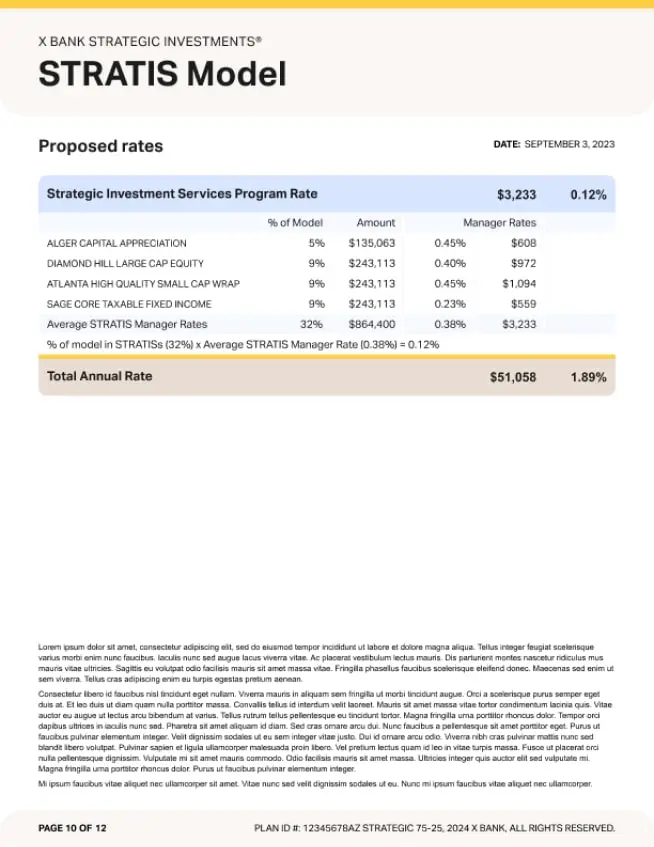
.webp)
After rigorously determining the final solution, I meticulously compiled the findings from these intensive sessions into a comprehensive Mural presentation. The Product Owner was blown away by my initiative, recognizing the immense value in how I had single-handedly tackled and solved this complex issue, saving countless hours of precious development time and eliminating the need for additional time-consuming research. This proactive approach not only resolved the immediate problem but also significantly bolstered UX's credibility within the organization, cultivating stronger buy-in for future UX initiatives.
Following co-creation sessions and research analysis, I developed design iterations. Mock-ups were reviewed with accessibility and development teams to ensure feasibility and adherence to accessibility standards. Collaborating with the content strategist, copy was adjusted based on research for clarity. Finally, design prioritization with the product and development teams categorized features as quick wins or requiring further validation through prototypes.
Revisions to selection options and content improved the functionality of this area, ensuring logical coherence.
The addition of a calculator improved user comprehension of mathematical logic and simplified the interface.
By merging sections into a single entity instead of separate ones, we decreased vertical space and cognitive load.
Switching the bolding hierarchy from total holdings to capital allocation provided clarity regarding the basis of rates.
To accommodate the financial advisor's preference for discretion regarding discounts, we introduced an "edit" text for easier spotting of the option. Furthermore, we incorporated functionality to apply discounts to individual columns, enabling advisors to incentivize higher investments discreetly.
Simplified busy user interface by converting frequently ignored legal disclaimers into a dropdown function, thus reducing cognitive load and vertical space.
.webp)
To enhance the effectiveness of our upcoming research sessions, I led a pre-research workshop with key stakeholders, including product owners, business analysts, technical leads, accessibility specialists, content strategists, and the UX team. This collaborative session realigned everyone on the project's objectives through discussions, enabling us to define and prioritize new research questions and assumptions. Together, we selected the most suitable research methodologies to gather the most valuable insights possible.

When I joined this new product team, I encountered a challenging landscape. Stakeholders were unfamiliar with UX principles, research was undervalued, and clear project objectives were lacking. Faced with low UX maturity, high resistance, and unclear goals, I took initiative to bridge the gap.
Phase 2 Research Objectives
Following the pre-research workshop, we established the following objectives for Phase 2:
Methodology Selection
To ensure effective data collection for these objectives, I reviewed the high-risk and high-uncertainty assumptions and research questions identified during the workshop. Given the need for mixed data (quantitative and qualitative) and the limited release nature of the product, I determined that continuing with a task-based usability study was optimal. This approach mirrors Phase 1 research, utilizing the Think Aloud method followed by open-ended qualitative questions. The questions will focus on core themes established in the workshop, including: ease of use, Functionality, Perceived Value, Information Architecture (Taxonomy), User Expectations and Future Wishes, Document Testing
Participant Recruitment
We recruited six participants for the study, excluding two subject matter experts who participated in an initial test to refine the discussion guide.
Each session was recorded in Zoom, and afterward, I meticulously reviewed individual transcripts, extracting insights to be transferred into Mural for affinity mapping to identify common themes. Below is the refined affinity map.
With many usability issues resolved in portfolio holdings, new themes emerged, primarily focusing on adding new features to support whole-level planning. Previous smaller themes from earlier research gained momentum, including removing the second column, adding a fourth column with total rates, making the tool accessible without entering the planning flow, and adding the ability to save as a PDF. Additionally, we validated that the improved taxonomy now made clear sense to users, that the calculator feature helped users understand the logic behind the math, the ability to spot discounts easily, and improved cognitive load in interface design.
During these sessions, we further validated user behaviors observed in previous sessions and reaffirmed the value proposition behind the tool.
Furthermore, at the conclusion of the interview sessions, we tested new prototypes with users, including A/B comparison testing of the existing and new document. Users expressed a preference for the updated document state as it reduced the number of pages needing to be printed/read and eliminated the need to flip pages back and forth for comparison, especially since they are double-sided printed. This change also allowed clients to more easily compare rates while seeing the benefits of investing more with the firm.

After synthesizing and affinity mapping the data, I distilled the findings into key themes and recommendations.
“That's the one thing that to me kind of throws me out. I have had to reread this a couple of times to kind of understand the difference on the three options... so then the first, the first column here, it's useless at that point.”
“In that probably another column here or like after prior to these or somewhere show the total rates... like probably on the left hand side or somewhere that gives me benchmarks with current versus proposed.”
“I mean I would be interested to see if it was a little more complex situation and what that might look like, I would love it if we could have maybe add like a total relationship... if there is a way for a branch team to toggle back and forth, maybe account and then relationship and kind of give both.”
“I would like to see this not just a step of planning the proposal, but I'd like to have like a cheat sheet so that when I'm talking to a client about transferring to advisory that I can pull these numbers.”
“I would like something for them to take home, especially if it's a client I'm trying to bring new assets over or move them from another firm, it'd be something tangible that they could actually look at... Can we say save and continue? I mean, does it have a print out?”
“When I added the discount in, I expected to see what the fee would change with a 20% discount...A save button or an enter button.”
“But I would love to see it If we were able to put in a toggle so that we could show them that if they wanted to see it, but we don't have to show them if they're not asking for it, if it's appropriate, then we can flash it. If not, then we don't.”
“Well, I just like the linear flow of kind of like boom, boom, boom, boom, boom (without calculator). But I like having this (calculator) up here because it would allow the client to see what we're adding in, so maybe give me the option to switch between the two”
“I'd like to compare that fee versus the expected discount because of the tiers when they bring in additional money, so I'd like to see if my discount on the fee program is close to them bringing in the additional money as well.”
“Something along the value proposition, if I could click maybe in the bottom to say here is my branches value proposition or here is our biography to kind of tie it back to what the service is that we're doing for the client.”
“Clients might be able to understand the difference quicker because the numbers are side by side... the benefit of working with us in a larger scale than you currently are, we're saying not only are we helping you manage more of your assets in one place, but on top of that we're also saving you on the fee side”
“Consolidated is easy to read. I mean, we hit that print button so much prints out. That having one page that are not trying to to flip through to try to find those pages. This would be it would be so much easier to show them -just one page”
“Yeah, definitely the second one (condensed design). The second one would be what I would prefer to show clients... But they could also see the breakdown clearly”
“I would still be concerned about flipping pages, so putting this up here, just the totals at top of first page would help”


Since this is a small pilot study, user interviews will be our primary method for validating our hypotheses. Metrics will not be incorporated into the hypothesis statements at this stage.
Users will proficiently utilize the tool, leveraging its features effectively
Majority of users will perceive the calculator as practical and valuable
Streamlined user interface will alleviate cognitive load
Users will features self-explanatory, requiring no further clarification
Revised header hierarchy will enhance clarity regarding the basis of rates
Updated taxonomy will promote ease of comprehension
Introduction of the calculator will facilitate users' grasp of calculation logic
Redesigned portfolio holdings layout will offer clarity and simplicity to users
Condensed document will enable clients and advisors to easily compare rates
Users will prefer condensed documents for their reduced printing needs
Users will favor the enhanced tool over the legacy experience for reviewing rates
Enhanced placement and wording of discounts will improve visibility
Following key research findings, I created design iterations through mockups. A review meeting with accessibility and development teams ensured feasibility and adherence to technical and accessibility requirements. Collaborative adjustments were made.
Next, prioritizing with product and development, we categorized designs as quick-follows, backlog items, or requiring further prototype validation based on implementation complexity.
Implemented the ability to print and generate output rates documents without requiring a client signature plan generation. This eliminates unnecessary steps and streamlines the workflow for users
Feedback indicated a mixed response to the calculator feature. To address this, we implemented user-controlled visibility based on individual preferences. Users can now choose to display or hide the calculator based on their needs.
Responding to user feedback, we added a total rates column displaying the current client rates. This allows users to easily compare rates and make informed decisions.
User research revealed a preference for a customizable interface, we implemented the ability to hide or display the second column based on individual user needs

Following the identification of features requiring further validation, I refined the prototype to clearly communicate the intended design and final product behavior. This included adding interactive elements to facilitate a more comprehensive user testing experience.
Prototypes for Comparison (Below):

Tap/click once on the screen to view clickable, interactive elements.
Tap/click once on the screen to view clickable, interactive elements.
Prioritize High-Impact Features: Before development, we'll focus on validating and refining high-impact features through updated prototypes. This includes:
Stakeholder Workshop: To define future research objectives, a workshop will be conducted with stakeholders. Key topics include:


