
A non-linear, iterative design thinking process was implemented to deeply understand users, challenge existing assumptions, define problems, and craft innovative solutions for testing.
.svg)
UXR Workshop
Usability Interviews
Affinity Map
Research Findings
.svg)

Problem & Goal User Personas Empathy Map
Journey Map

How Might We
Design Iterations
Design System
Prototype

HEART Workshop
SUS Survey
NPS Survey
Next Steps

UX & UI Designer
UX Researcher
8 weeks
Prior to initiating the research phase, I orchestrated a comprehensive remote stakeholder engagement workshop to cultivate buy-in and crystallize our research objectives. This strategic gathering convened a diverse array of key stakeholders, encompassing senior leadership, product owners, marketing professionals, and members of the UX team. Employing a meticulously crafted workshop template, I facilitated a collaborative and synergistic process:
This refined approach not only enhanced stakeholder alignment but also laid a robust foundation for our subsequent research endeavors, ensuring that our efforts were strategically focused and comprehensively informed.

Pilot Research Objectives
Following our workshop, we established the following objectives for user research study:
Methodology Selection
To determine the most appropriate user research methodologies, we conducted a thorough analysis of the high-risk and high-uncertainty assumptions and questions identified during our workshop brainstorming session. Our assessment revealed the necessity for collecting both quantitative and qualitative data, as well as the potential to encounter users unfamiliar with the system. Based on these considerations, we concluded that a task-based usability interview incorporating the Think Aloud protocol would be the optimal approach.
This primary methodology was designed to be augmented by open-ended, qualitative follow-up questions. These questions were strategically crafted to delve into core themes that emerged from the workshop, including:
Participant Recruitment
For the study, we carefully selected and recruited eight participants. This sample size was determined to be sufficient for capturing a diverse range of user perspectives while remaining manageable for in-depth qualitative analysis. It's worth noting that prior to the main study, we conducted a preliminary session with one subject matter expert. This initial engagement served a dual purpose: it allowed us to test the efficacy of our discussion guide and provided an opportunity to refine our approach based on expert feedback, thereby enhancing the overall quality and relevance of our research protocol.
We captured each interview via Google Meet recordings, distilling critical observations and transcripts into a Mural-based affinity diagram to uncover common patterns.
Our investigation uncovered several critical pain points - the interface's navigation proved particularly challenging, with participants struggling to locate and manage products effectively. Users found it difficult to identify items, and expressed frustration with limited search capabilities. The platform's organizational structure left much to be desired, causing confusion and impeding efficient task completion. Participants also noted the absence of bulk editing tools and the inability to easily view crucial product parameters.
Despite these hurdles, our study also highlighted exciting avenues for growth and improvement. Participants showed enthusiasm for expanded capabilities, particularly in areas of data visualization and inventory management. They expressed a strong desire for advanced sorting and filtering options, as well as features to monitor stock availability. Users also emphasized the need for a more intuitive layout that would streamline their workflow and enhance overall usability.
One unanticipated discovery stood out: users placed high value on customization options for promotional campaigns and expressed keen interest in preview functionalities. This insight opens up new possibilities for enhancing user engagement and satisfaction. Participants also voiced interest in more sophisticated tools such as split testing capabilities, advanced analytics, and automated inventory management features.
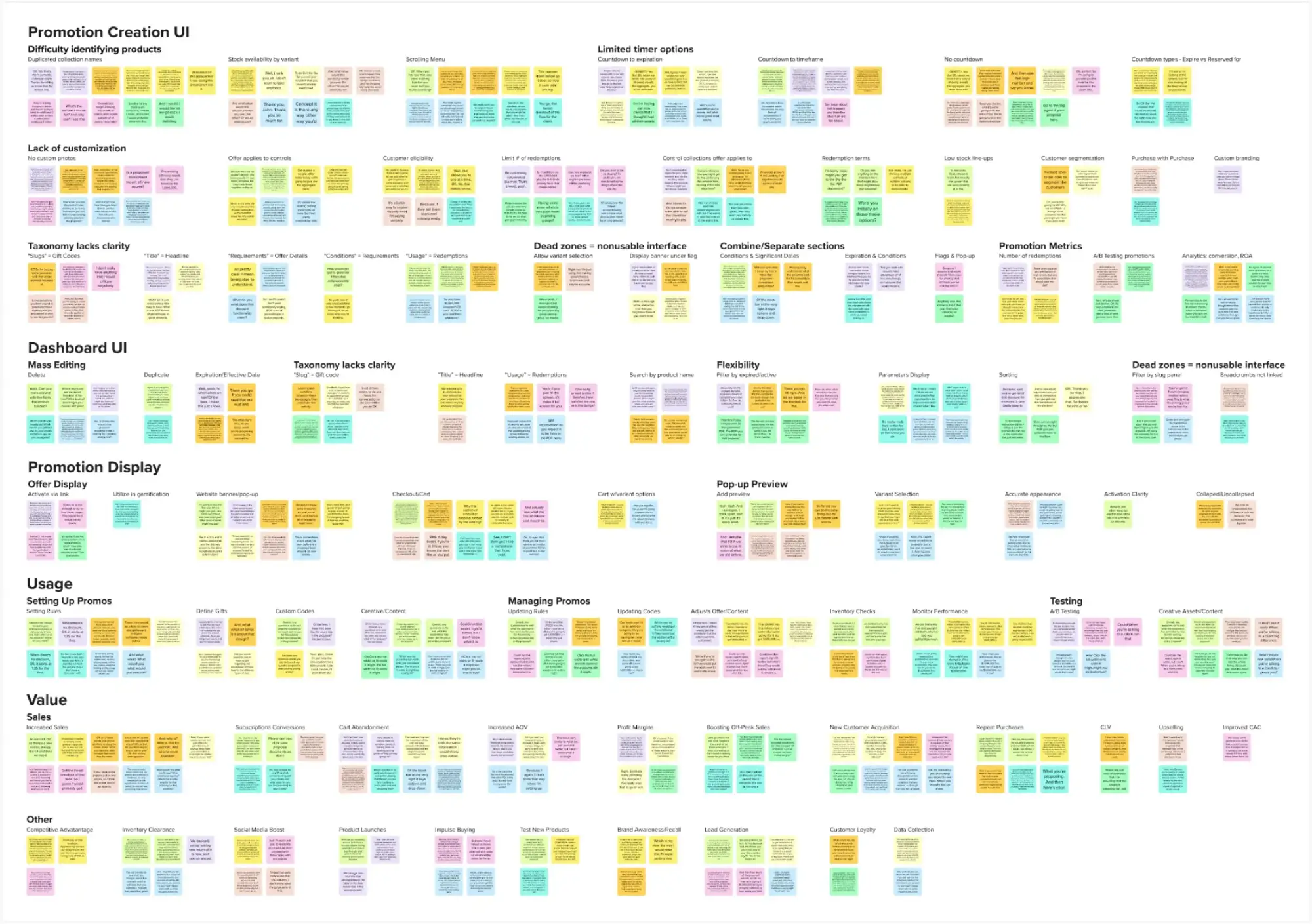
Following a comprehensive analysis, I synthesized the research data into key thematic clusters. This process of consolidation revealed several pivotal insights that emerged consistently across user feedback.
“It's such a hassle to seek out the products that I want to add to my promotion-searching by Shopify product ID number is clumsy and unintuitive… the search is almost useless”
“I mean, I just feel like I'm losing so much time for all these repetitive tasks … If I want to change the requirements in several offers at one time, I need to enter each offer and do the same action again and again and again”
“I am having a hard time keeping track of all of the different rules … I'm having to dig through the backend of each offer trying to piece together what the parameters are. It would be so much easier if I could view all of those details in one place”
“I catch myself all the time having to translate 'Promotion Speak' into regular English. Why in the world they use the term 'slug' for gift codes, I have no idea. That's just strange and confusing. And 'title'? For what would otherwise be called the headline, or name, of the offer?“
“'filter by slug' option is entirely useless to me… give me ways to sort, based on details, that actually pertain to me, like the promotion name, start and end dates, redemption counts, that kind of stuff”
“Adding in some basic filtering and sorting functionality would go a really long way toward making this app actually usable for my needs”

“I'll never be able to scroll this ridiculously long dropdown to find what I want to add. It's just names - that's really not enough to let me know which item it is… maybe some actual images would help.”
“I don't have any way of telling if we have enough of a product in stock to feature it in an offer, so I've had times when I've set an offer up and then found out we didn't have enough in stock.”
“And with thousands of products in the catalog, it turns into this endless chore of scrolling and scanning line after line….search field would be total no-brainer”
"Terminology just confuses me…this space calls countdown timers 'flags'… it's a never-ending guessing game of what all the vague terms mean”
“Banner needs to be visible, that kind of is the whole point! Having an option to turn it off completely seems rather silly.”
“I mean, I don't know who it is who thought it was a great idea to shove one of the biggest metrics to the bottom of the page...“
Features requested:
“The timer is pretty inflexible. there have been times where I wanted the countdown to act like a 1-hour flash sale or where I don't actually want one at all”
Sections to revise:
“Why are the conditions separated from the actual dates when those things go hand and hand? It would make way more sense to combine those“
Features requested:
“I need more flexibility… we have beautiful lifestyle photography I would prefer to use, but right now it pulls in whatever the default product shot is and it isn't all that enticing”
Features requested:
“One of the biggest issues is that there's no preview whatsoever for how the pop-up is really going to look in reality … it feels like I'm building these offers blind”
“We're just kind of crossing our fingers that the arbitrary settings we picked will resonate. Or we have to run promotions sequentially to try and gauge which ones moved the needle more… that's not an effective as A/B testing”
“Don't get me wrong, having basic redemption counts is helpful but numbers alone don't really tell how well a promotion performed... I need much more robust data and analytics”
“It would help me if I could line a few different gift options up in order of preference, so if the first one sells out, it automatically switches to the next one.”
“We have an issue with overselling GWPs, so we have to reach out to customers who think we’re bait and switching… it should automatically stop offering a gift when it goes out of stock“
“We know from data that different audiences react differently to messages and incentives... being able to segment would allow us to convert easier”
“There's no brand connection, no sense of exclusivity... a popup that's on-brand is more likely to appear authentic and less like spam"
“The ROI is off the charts. It's increased our sales, AOV, and customer lifetime value. This app is easily one of our best investments.”
“It works really well in our subscription acquisition ads… our data showed a lot of first-time customers - they are so much more likely to subscribe with the extra incentive.”
“With the availability of a free gift, it has been easier to entice a new audience, getting them through the door to try products is much easier”
“We would have huge drop-offs in traffic when we weren't running sales, but with a free gift during those times, we've kept the cash flow consistent.”
“In a crowded marketplace, you win by making customers feel special, we can do something special for the customers and give people a reason to prefer us over others”
“Abandoned carts were significantly reduced, especially by the use of the countdown timer, it is a little nudge to remind them of the value being given”
“Our margins improved because we were able to cut back on blanket discounts. Free gift offers perform better in click-through than discounts”
“It's low-friction way to capture lead information, people are willingly offering up their email to unlock whatever incentive we're advertising”
“It's a testing ground for new product lines and collections, help us gauge customer interest before committing to a full-scale launch”
“These offers have become a savvy inventory management solution that helped us cut overhead costs”
The study's focused nature necessitated reliance on user interviews for validation. As a result, hypothesis statements were qualitative, omitting quantitative success indicators or metrics.

Users effectively leverage the tool
.webp)
User interface is user-friendly
The app delivers significant user and/or business value
The taxonomy and labeling of elements are clear and meaningful
Users find the placement and accessibility of key elements intuitive
The interface provides users with necessary information and flexibility
Interface elements are functional and beneficial
The platform offers sufficient customization options
The app seamlessly integrates with Shopify stores
The menu and navigation facilitate quick and easy product discovery
Users find it easy to identify and manage products and promotions
The timer feature is valuable and flexible across various offer types
After presenting the findings to stakeholders, I synthesized the core insights into problem and goal statements that reflect the critical user pain points and objectives identified during the research.
E-commerce managers seek an efficient and intuitive solution to create, manage, and optimize promotional campaigns for their online stores. They desire a streamlined interface that simplifies product selection, automates inventory tracking, and provides clear performance insights, ensuring a smooth and productive experience for both campaign managers and their customers. The current process, marked by manual tasks and limited visibility, hinders their ability to craft effective, timely, and profitable promotions.
Develop an intuitive, comprehensive promotional management system that streamlines product selection, automates inventory tracking, and provides real-time performance metrics. The solution should enable swift offer setup and updates, incorporate visual previews, and facilitate customer segmentation. Key objectives include minimizing manual tasks, enhancing campaign performance visibility, preventing overselling, and dramatically improving the efficiency of offer creation and modification processes. Success will be measured through user adoption rates, campaign performance improvements, and qualitative user feedback on workflow efficiency.


Research insights validated our target demographic, resulting in the development of two representative user personas that encapsulate our customer base's core needs.

.svg)
Constantly tracking inventory manually is a nightmare, integration with shopify data would be a huge win
Jared, a veteran marketing manager with 10+ years at major retailers/e-commerce, adopts new tech & data-driven methods. He runs A/B testing, craving agility to make analytical yet beautiful promos. Top priorities: quickly find hot promos, track inventory/metrics, update offers easily. Values efficiency, flexibility, transparency, automation.
• Manual inventory tracking • Managing shifting timelines and changes based on A/B data • Tracking and updating codes • Difficulty in distinguishing between products
• Efficiently find and select promotional offer products • Easily track inventory • Effectively monitor performance metrics • Swiftly update and set up offers


Launching promos feels like a guessing game without preview, I'd love to see how the offer looks before pushing it live
Hannah is marketing director with an economics background, she prioritizes data-driven strategies, segmentation, and profit maximization. She favors dynamic, visually-rich offers that are easily updatable and scalable, her frustrations stem from under performing campaigns, and missed opportunities with high-demand products.
• Lack of promo preview • Product overselling leading to missed profit opportunities • Underperforming campaigns • Difficulty in duplicating and editing content
• Eliminate the need to spend budget on creative • Accurately preview offers visually • Segment customer base by offer types • Efficiently update offers quickly


User research and analysis revealed key attitudes and behaviors, providing crucial insights into user needs and motivations.
• Product IDs aren't useful, can't we use names?
• These dropdowns are infinite. I can't find my stuff
• Man, I wish we could batch edit promotions. I hate updating them one at a time
• These filters are crap
• Is there a bulk edit for these promotions? Updating them individually is killing me
• Why can't I see how much stock a product has before adding as gift?
• Option to select variation from popup is missing
• Provide countdown timer with approximation of time frame
• Would love to be able to cap the amount of times a customer can redeem the same offer
• Better search would save so much time
• If the names were more clear this would be easier
• If the interface of the app was easier to work through this could be saving us so much time
• Concerned the promotions are not converting because of the difficulty of setting them up
• Mass edit/deletion capabilities are a must
• I waste ages trying to find a product
• Inventory checking is always a headache during promotions
• We must use third-party tools for A/B testing of offer content; this app does not support that
• Integrating this app with our gamification platform is a huge plus
• It is impossible to create a sense of urgency with the timer
• Copy and paste promotion details from prior campaigns to save time
• Every time I am trying to set up a new promotion, it annoys me so much
• These unclear labels make me feel like I am constantly making mistakes
• I really have a sheer belief that, considering the limitations this app has, we're losing potential sales
• Too many limitations
• This app is driving frustration into my workday
• This app is killing me; it's supposed to be a time-saver, not a waster
• Not frustrating at all — this is really clunky to use
A visual representation of the user journey was created, mapping key touchpoints and interactions to identify opportunities for enhancing the overall user experience.
Research findings were reframed as aspirational "How Might We" questions, transforming identified design challenges into opportunities for innovative solution exploration.
enhance product discovery for users?

streamline the promotion creation and editing process?
optimize interface usability?
maximize user efficiency and time-saving?
restructure the app for intuitive navigation?
provide users with their desired level of customization?
refine taxonomy for self-explanatory labeling?
Post-analysis, design iterations were developed and reviewed with the product team and developers. This collaborative process ensured feasibility and facilitated the prioritization of features, aligning implementation strategies with project goals and resources.
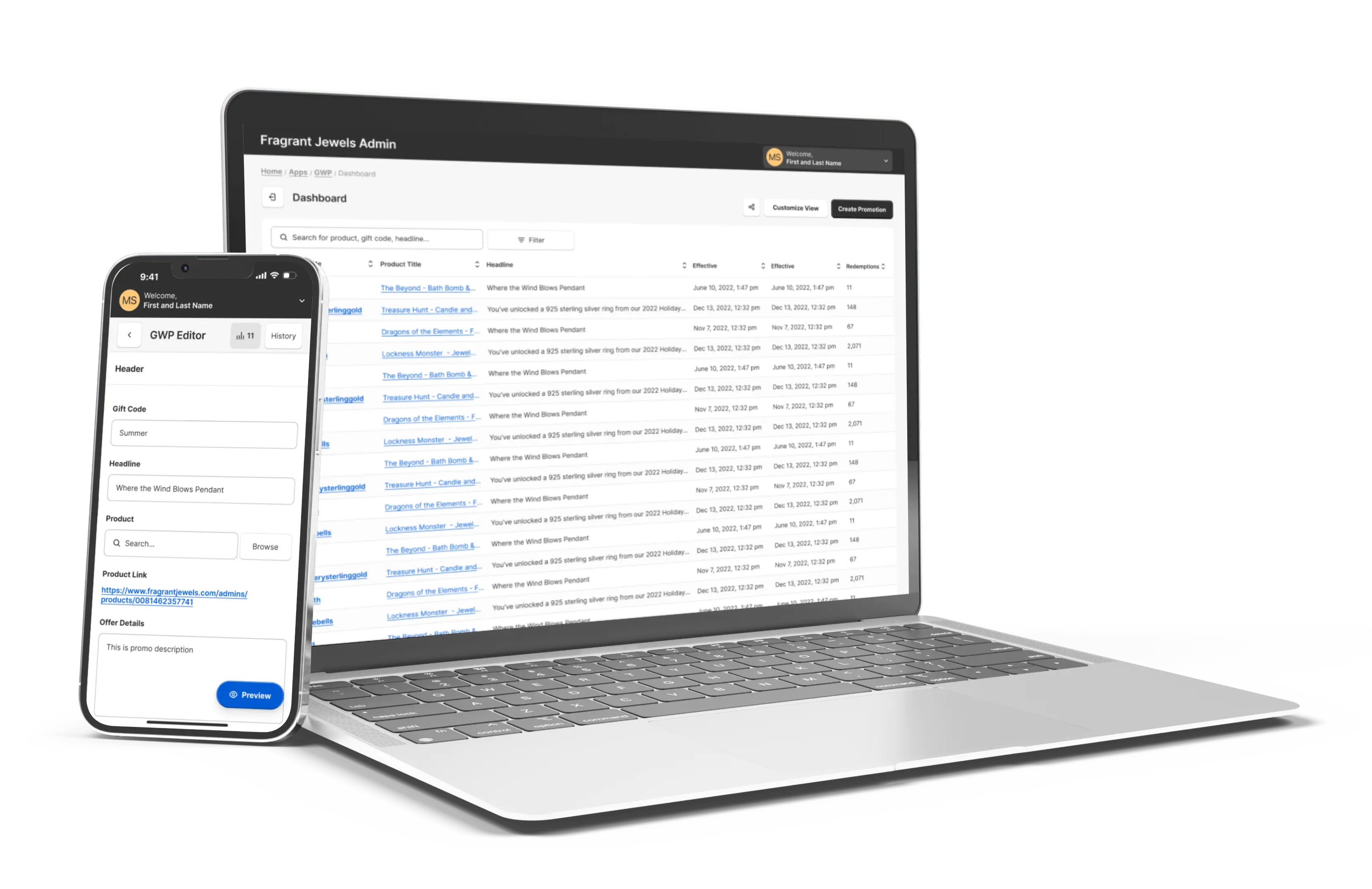
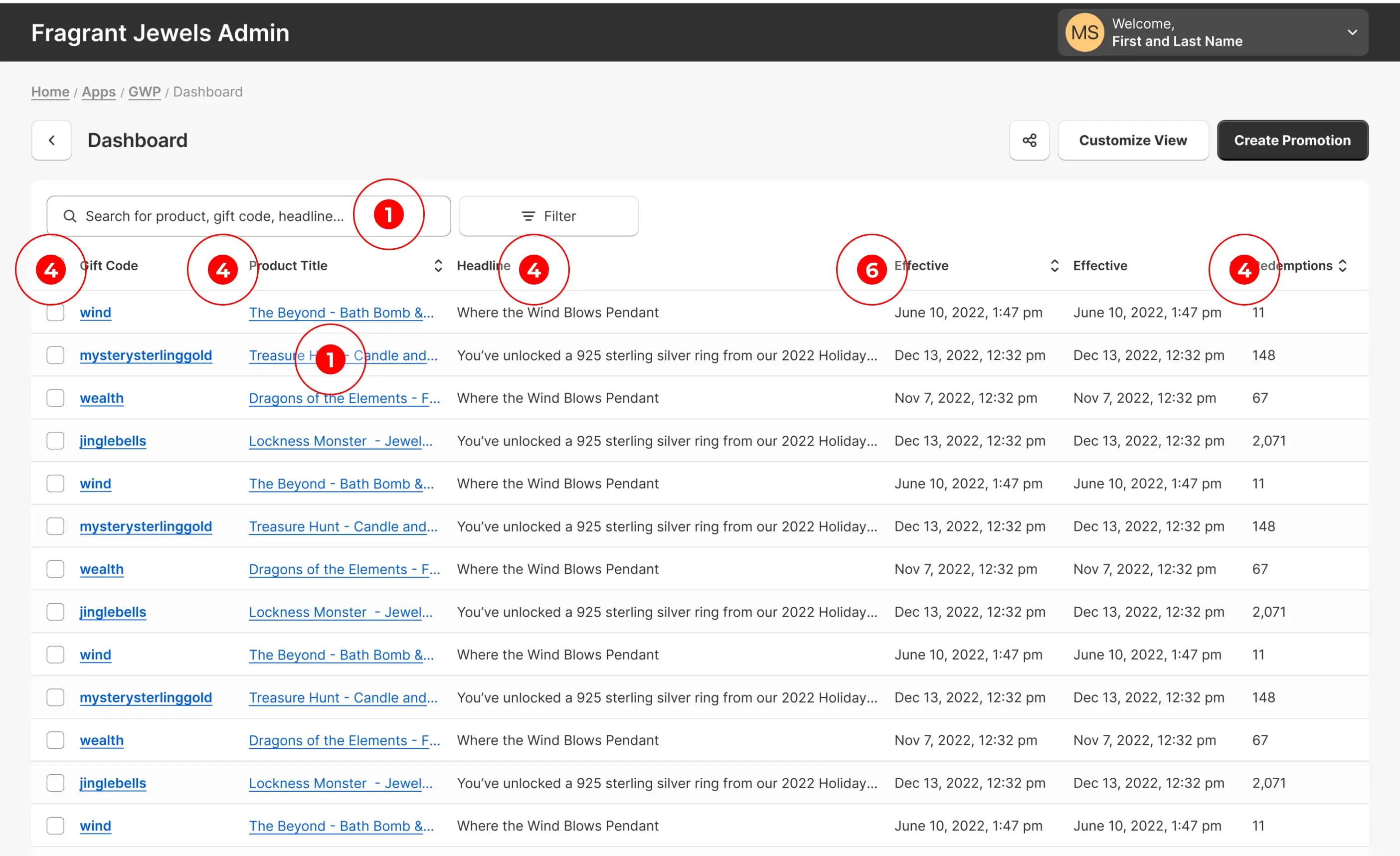
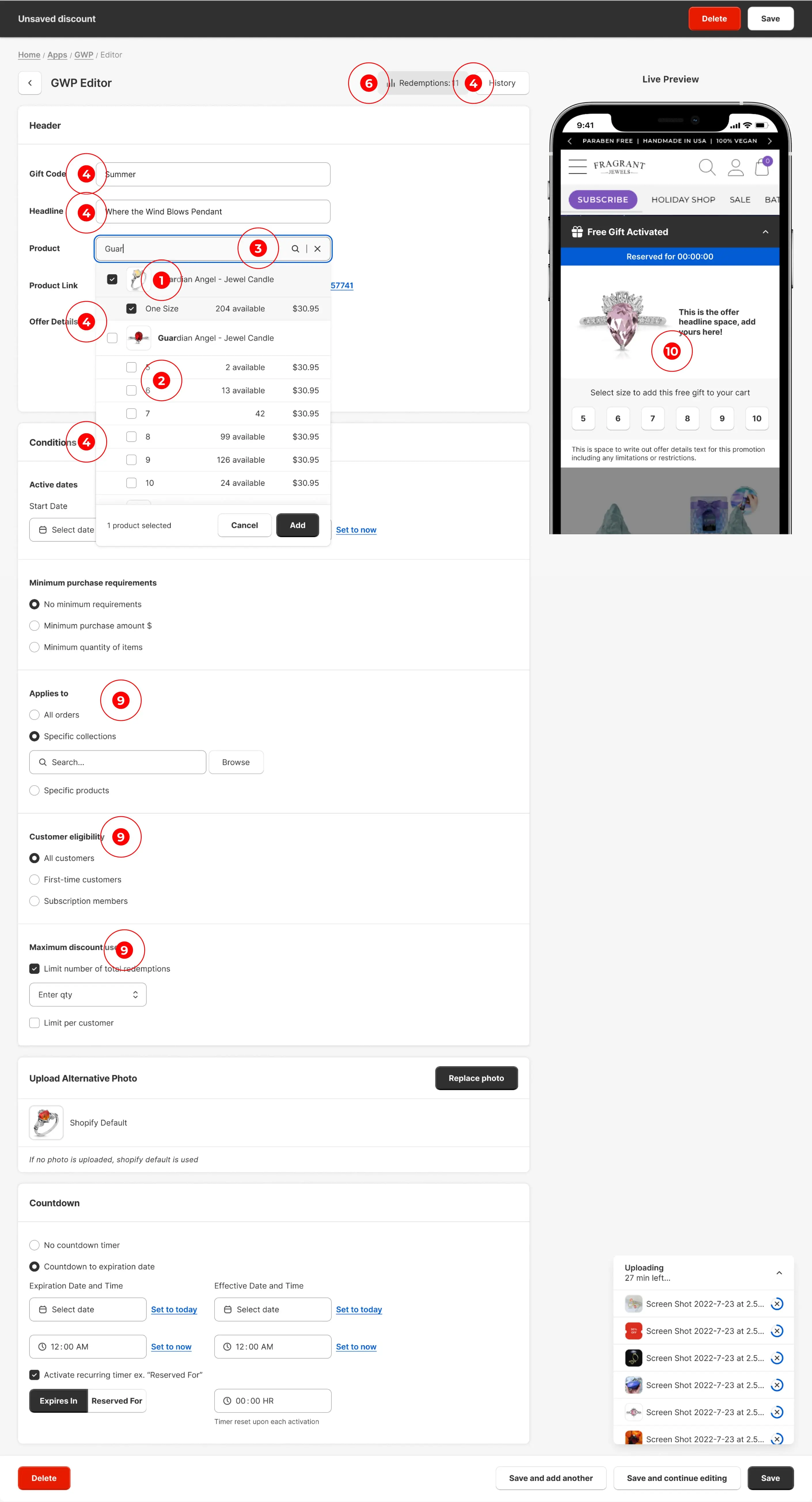
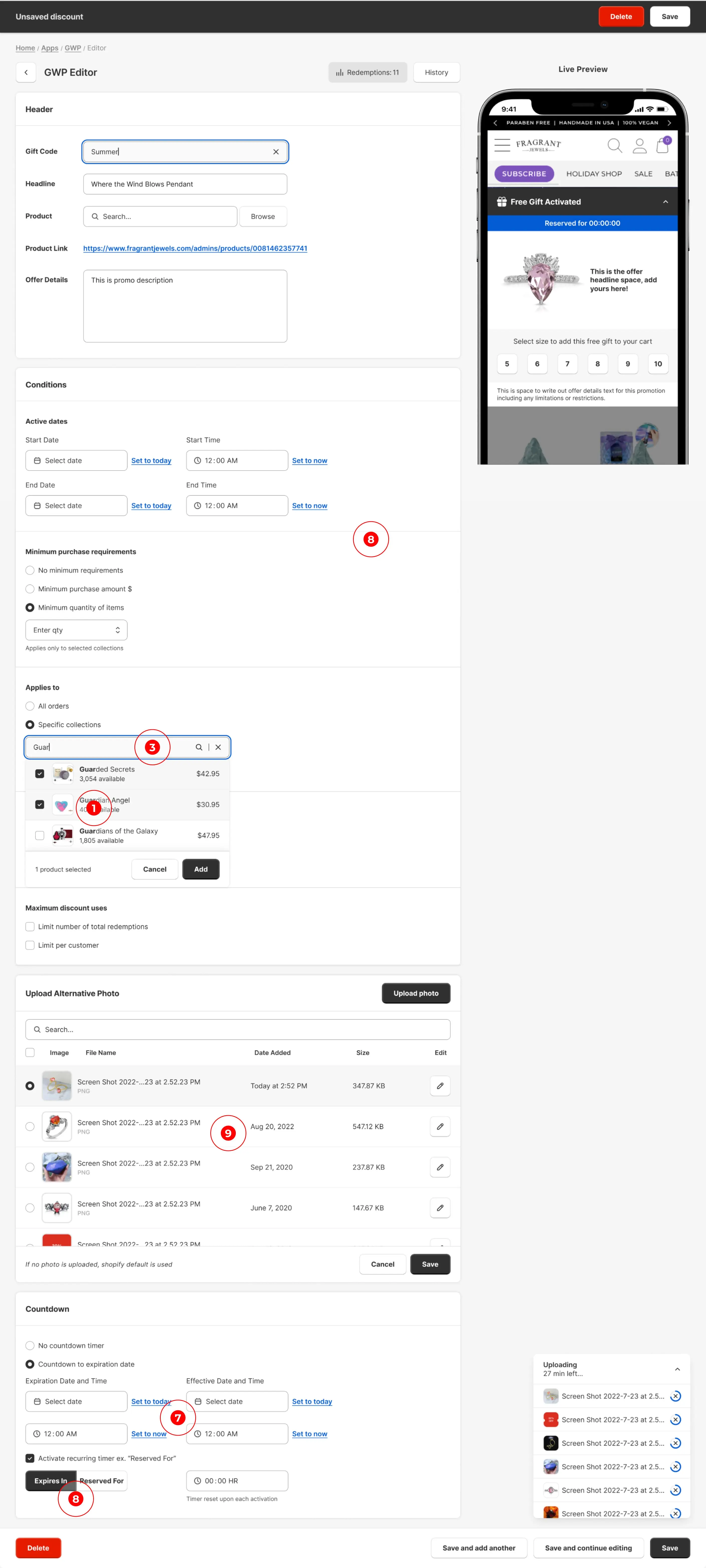
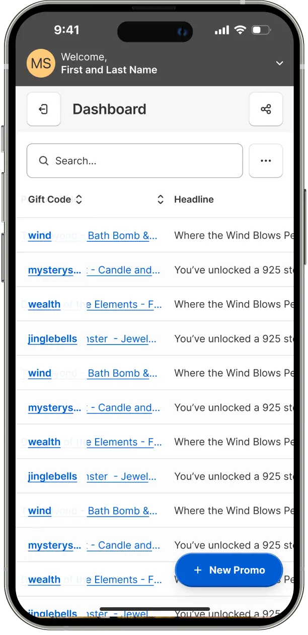
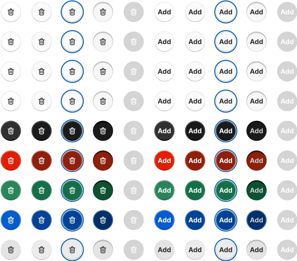
Implemented customizable view with option to toggle between product ID and title for easier product identification. Expanded search capabilities beyond promo code.
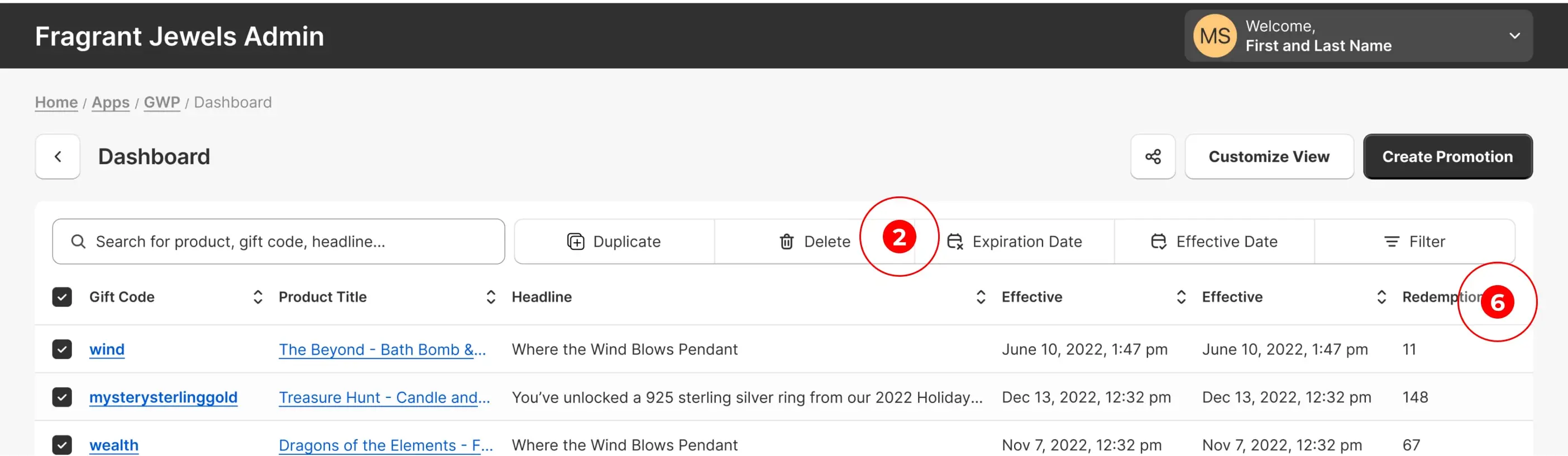
Added functionality for mass editing, deleting, and duplicating, including ability to bulk modify expiration and effective dates.
Created customizable view feature allowing users to enable additional parameters they wish to see.
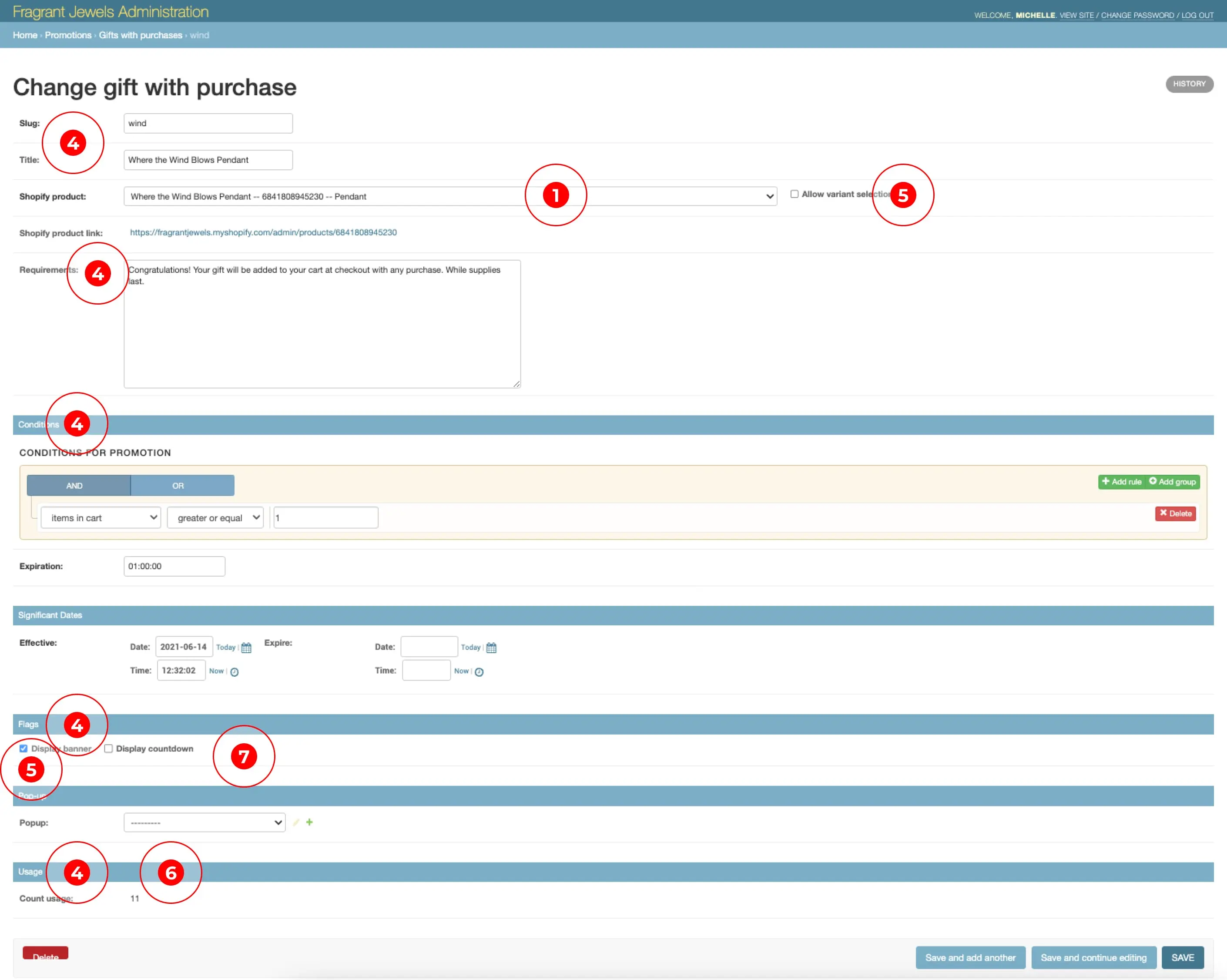
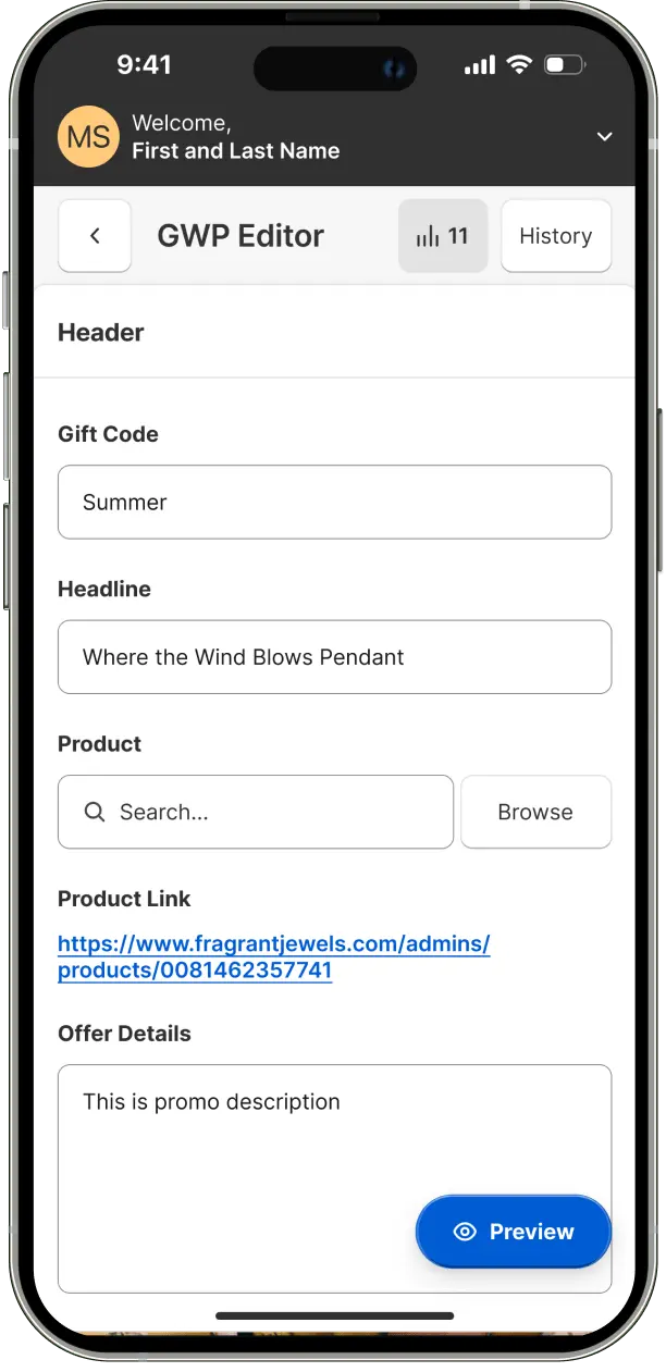
Updated terminology: "slugs" to gift code, "title" to headline, "count usage" to redemptions, "requirements" to offer details, and "conditions" to requirements.
Removed right-hand filter panel and hidden actions dropdown. Moved these actions to activate upon item selection.
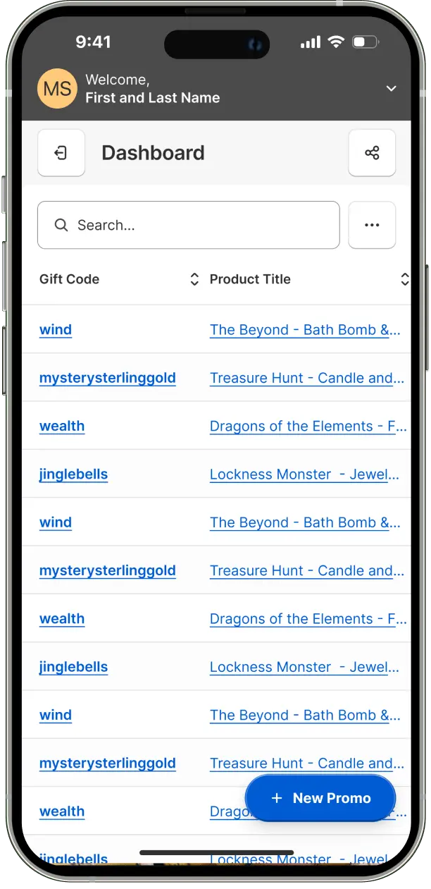
Incorporated requested filters - active, expired. Added sort up/down functionality to each column.

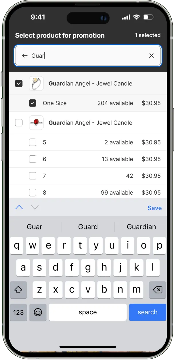
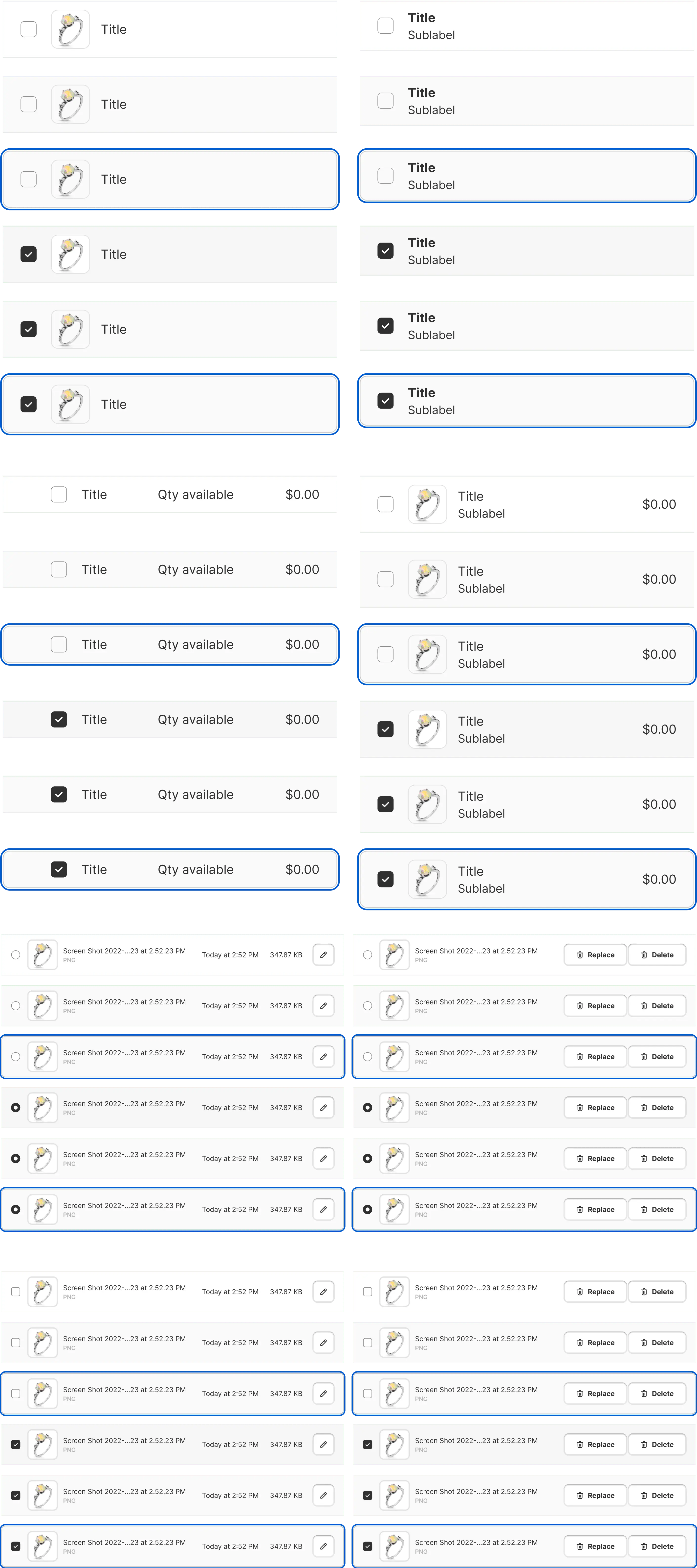
Integrated product imagery into gift and product search results.
Incorporated product stock data synchronized from Shopify.
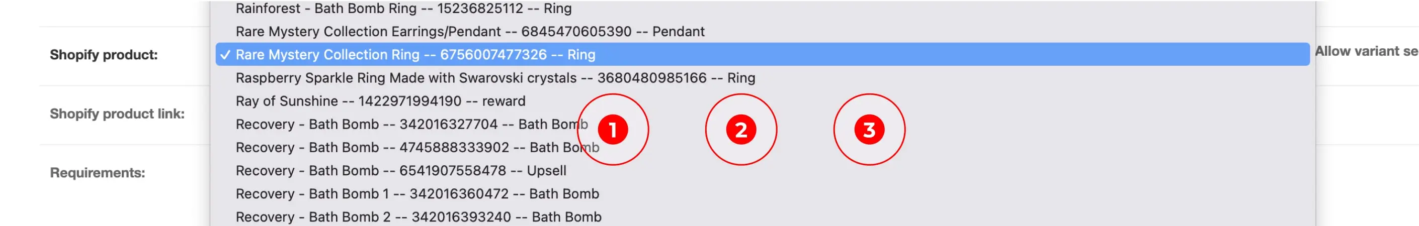
Implemented ability to search by product name and select multiple products for a promotional offer, replacing long scrolling.
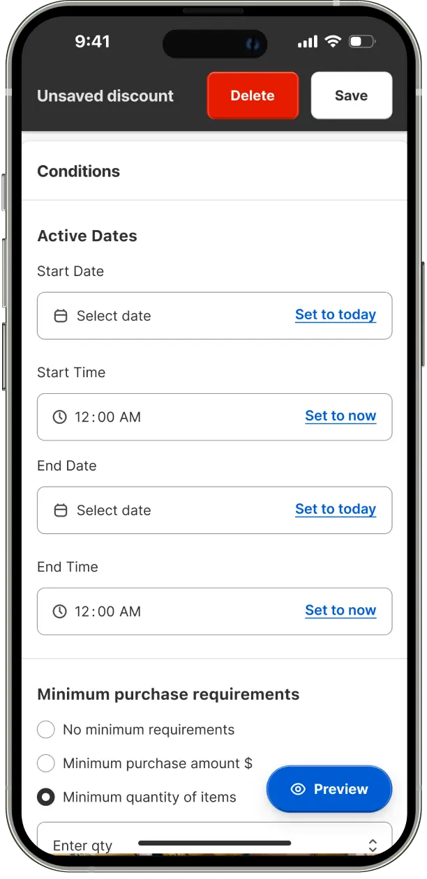
Updated terminology - "significant dates" to active dates, "flags" to countdown timer. Removed "allow variant selection" and "display banner" options.
Removed non-functional interface components including banner visibility controls and allow variant selection
Relocated redemptions information higher on the page for improved visibility without scrolling.
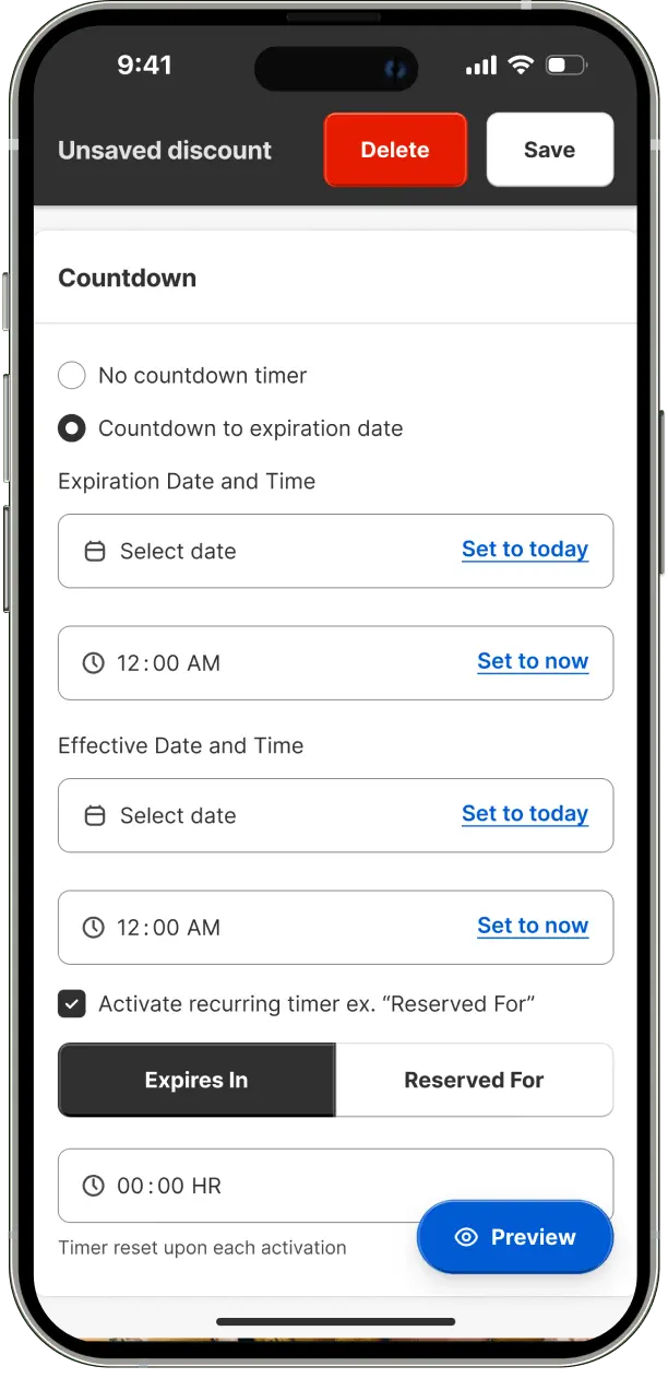
Upgraded countdown options: timeframe selection, no-countdown option, and added expire in/reserved for features.
Combined Conditions with Significant Dates, Countdown with Expires. Separated Conditions from Expiration.
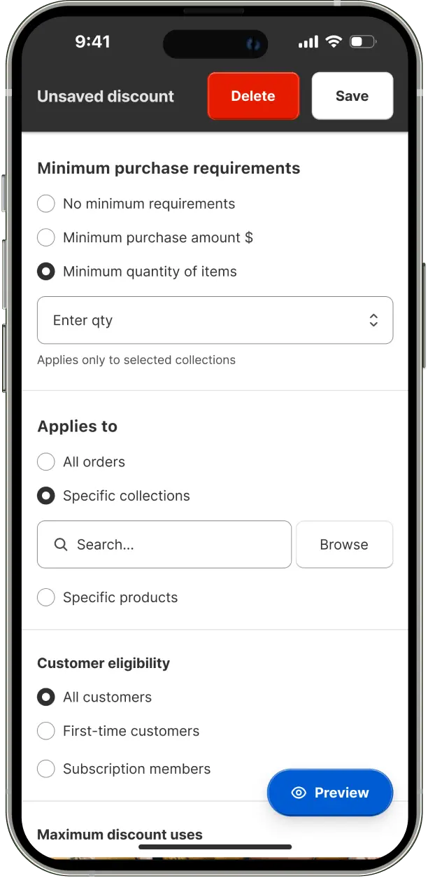
Added custom photo upload/management, customer eligibility controls, specific product/collection application, and offer/cart redemption limit settings.
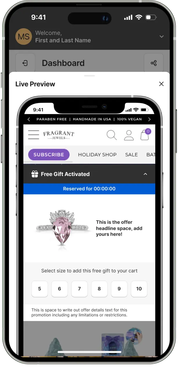
Integrated accurate offer preview with copy/image display, offer activation communication, and collapsible variant selection design.
Mobile-responsive prototypes were developed alongside desktop versions to ensure compliance with Shopify app requirements and provide a seamless cross-device experience.

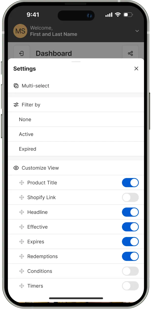
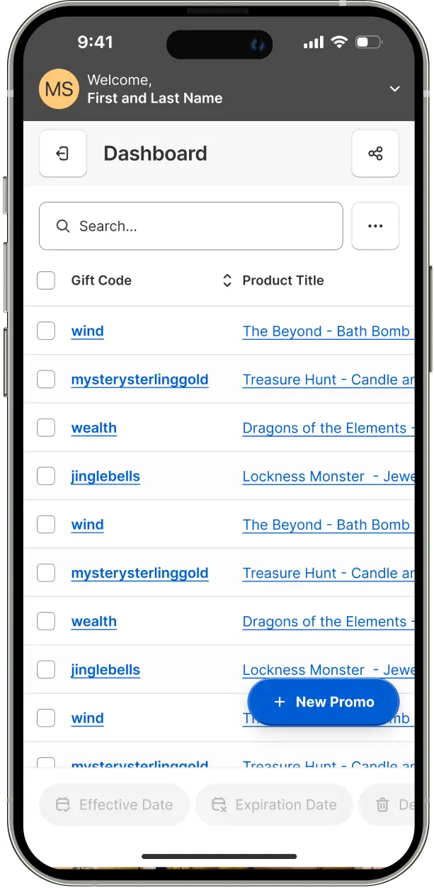
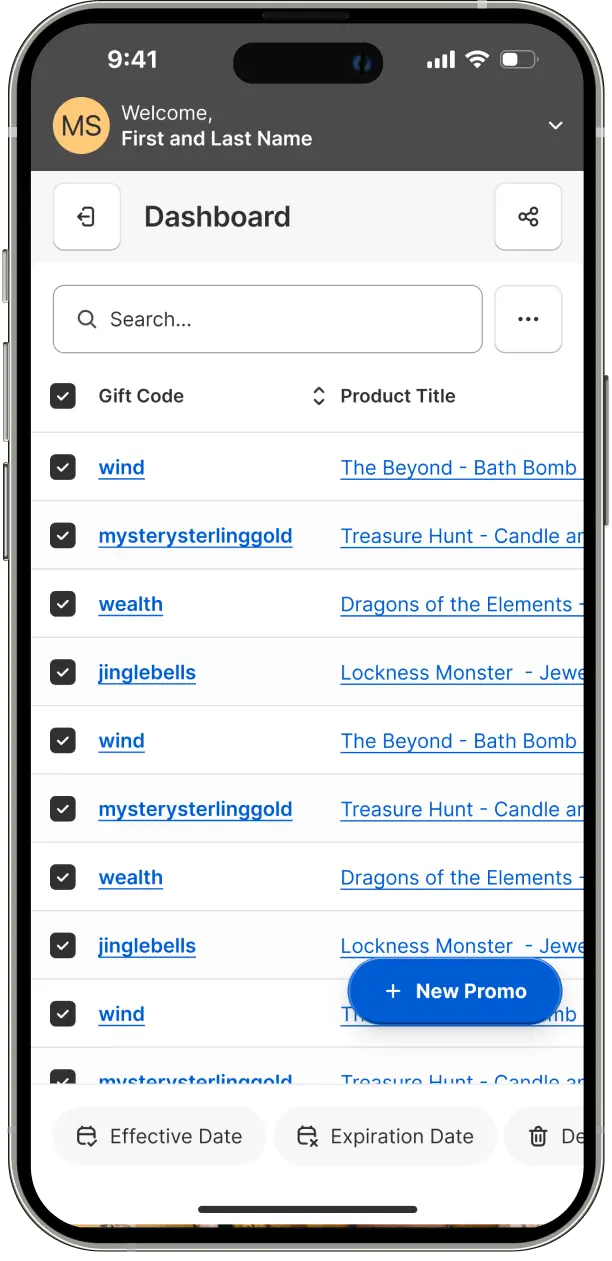
The dashboard interface was optimized for mobile, featuring a compact menu that consolidates multi-select controls, view customization options, and filter settings. This streamlined approach maintains desktop functionality while simplifying the mobile interface. A quick promo creation button was strategically placed in the bottom right corner, adhering to the Gutenberg Principle for optimal scanning and usability. All interactive elements were sized to ensure touch-friendly targets.
An adaptive column width system was implemented, automatically adjusting on scroll to a narrower, semi-transparent format. This design choice maintains row and gift code visibility while optimizing the overall table view on smaller screens.
A readily accessible promo preview button was incorporated, also following the Gutenberg Principle for ideal placement. The product search bar was enhanced with high contrast design, emphasizing its importance and guiding user action. A floating save/delete bar appears on scroll, allowing users to quickly preserve progress or abandon tasks without navigating to the page bottom.

Intuitive quick links were introduced to facilitate rapid date and time selection. The calendar interface was refined to allow efficient month and year selection without excessive navigation. Advanced timer functionality was added, enabling countdown to expiration and time window-based timing options, enhancing promotional flexibility.
Following the identification of features requiring further validation, the prototype was refined to clearly communicate the intended design and final product behavior. This refinement process included the addition of interactive elements to facilitate a more comprehensive user testing experience.
A comprehensive design system was developed, encompassing visual guidelines for color, typography, icons, spacing, grid, shadows, and components. This system was supported by primitive, semantic, and composite tokens to ensure consistency and scalability.
A typography system was established, featuring a hierarchy of headings and body text styles. This system was designed to enhance readability, establish clear information hierarchy, and contribute to the overall visual impact of the interface.A color scale scheme was implemented to create an attractive and engaging interface. This scheme was crafted to effectively communicate meaning, create contrast and hierarchy, evoke appropriate emotions, and reinforce brand identity.
.svg)


The complete typography token set and comprehensive design system can be viewed in the Figma project file.
A color scale scheme was implemented to create an attractive and engaging interface. This scheme was crafted to effectively communicate meaning, create contrast and hierarchy, evoke appropriate emotions, and reinforce brand identity.
A comprehensive token lists is available for examination in the Figma file.
A comprehensive token lists is available for examination in the Figma file.
Grid systems were developed for various device types, providing a structured framework for the placement of UI elements. This approach ensures visually harmonious and balanced layouts across different screen sizes.


A standardized spacing system was created to maintain consistent spacing between UI elements. This system contributes to a visually balanced layout and improves overall user experience.
Consistent border radius and width standards were established for UI elements. These standards help define boundaries, establish visual prominence, enhance readability, and improve the overall structure and clarity of the interface.
A shadow library was designed to create a sense of depth and dimensionality within the interface. This library helps distinguish elements and create a layered visual hierarchy.
A comprehensive token lists is available for examination in the Figma file.
An icon library was developed to facilitate quick and efficient communication of information. These icons contribute to a recognizable and memorable interface design.


A set of reusable low-level components was created as a foundation for the larger component library. These components and their variants ensure design cohesion while accelerating workflow. Components were developed using Master components and Auto Layout for cross-device responsiveness, allowing for effortless updates and automatic realignment. All buttons were designed above 48px to enhance user-friendly navigation and improve accuracy.


The full range of components and the entire design system are accessible for review within the Figma project.
Having redesigned the app, we need a way to measure success of the redesign, to do that I facilitated Google HEART Workshop that helped the stakeholders map to prioritize outcomes, brainstorm goals, signals ans assign metrics and tools to measure them.
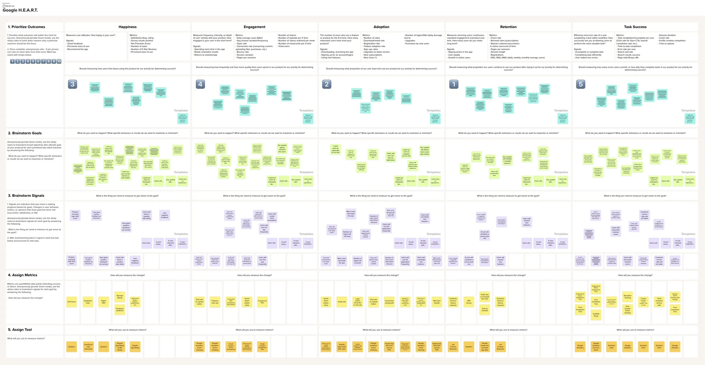
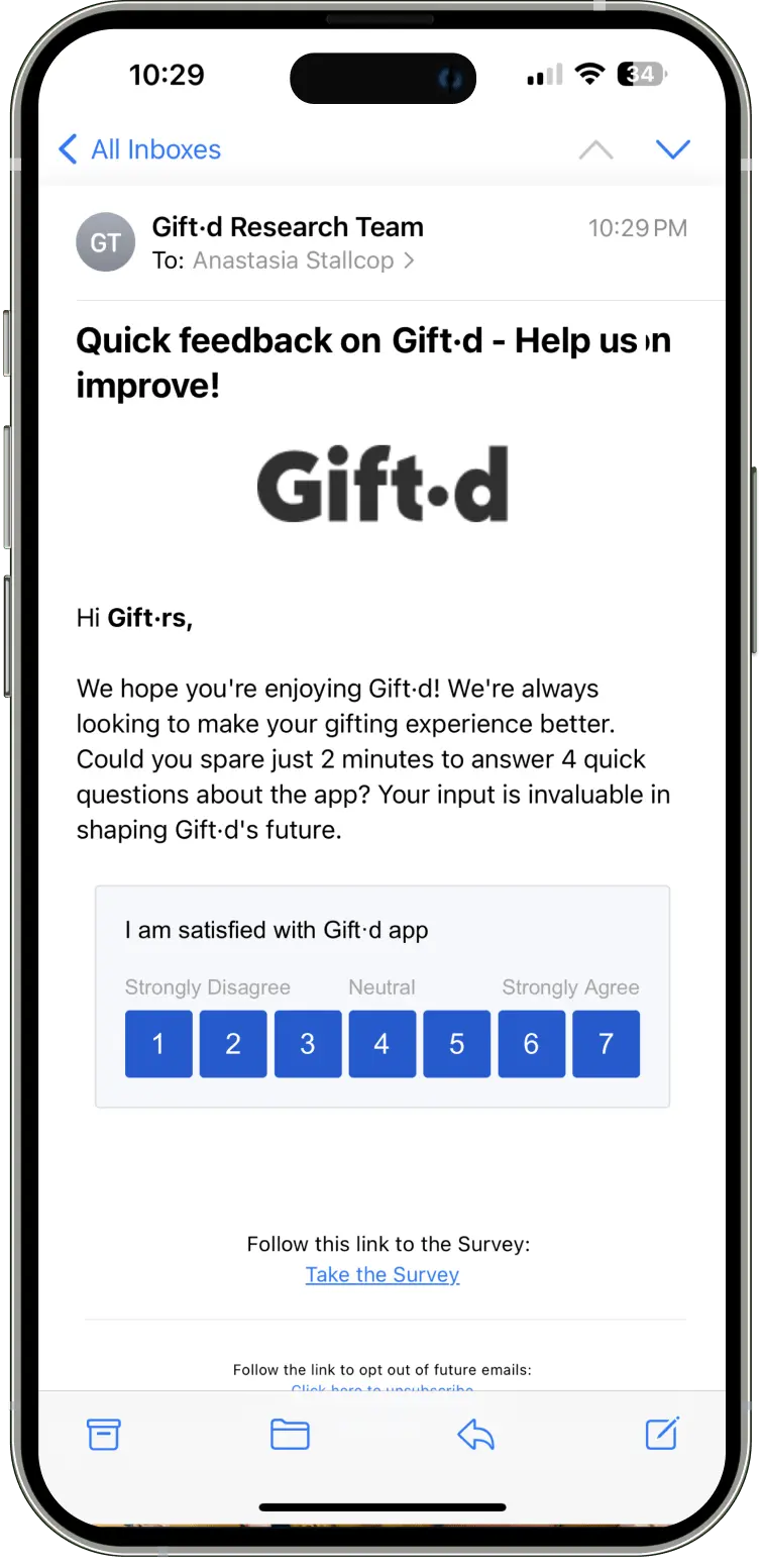
Following the Google HEART workshop, we determined to implement the System Usability Scale (SUS) to quantify product usability, learnability, and user satisfaction. This validated metric provides valuable insights even with smaller sample sizes, making it ideal for ongoing user experience optimization.
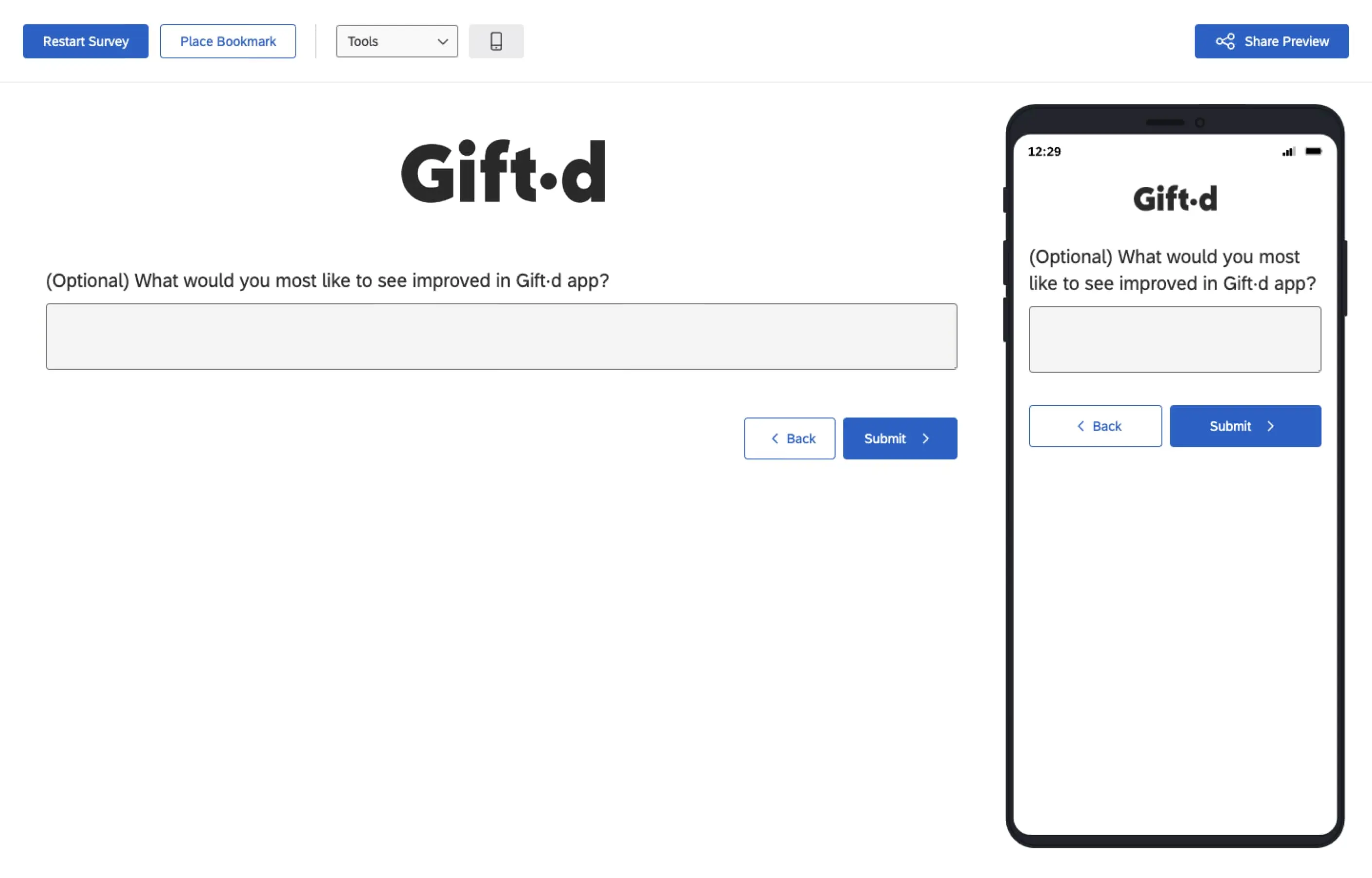
We established a dual-channel SUS data collection strategy. Primarily, we integrated in-app SUS surveys using Pendo. Secondarily, we developed a Qualtrics-based SUS survey with an optional qualitative feedback component, distributed via email. This multi-touchpoint approach aims to maximize response rates and capture diverse user perspectives.
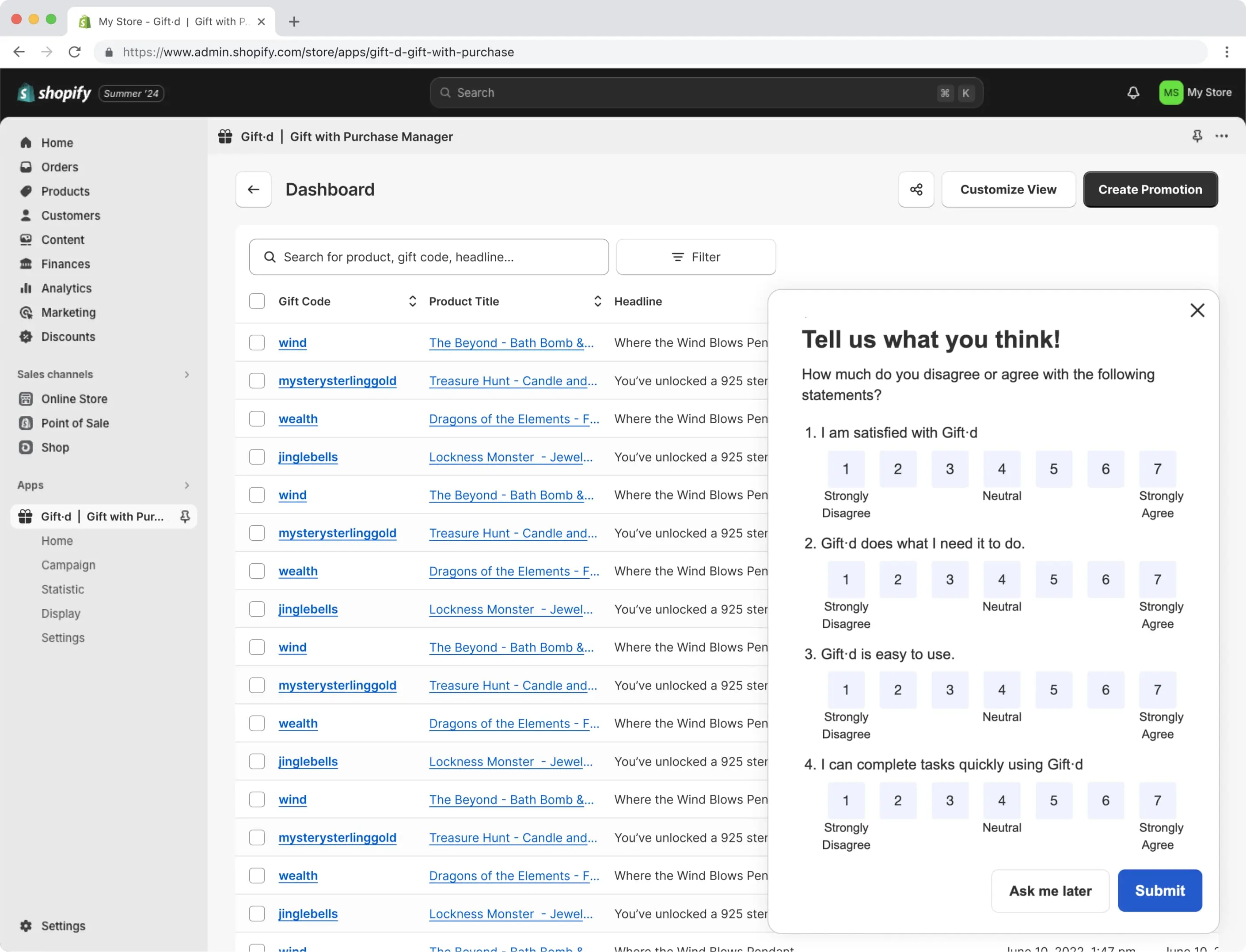
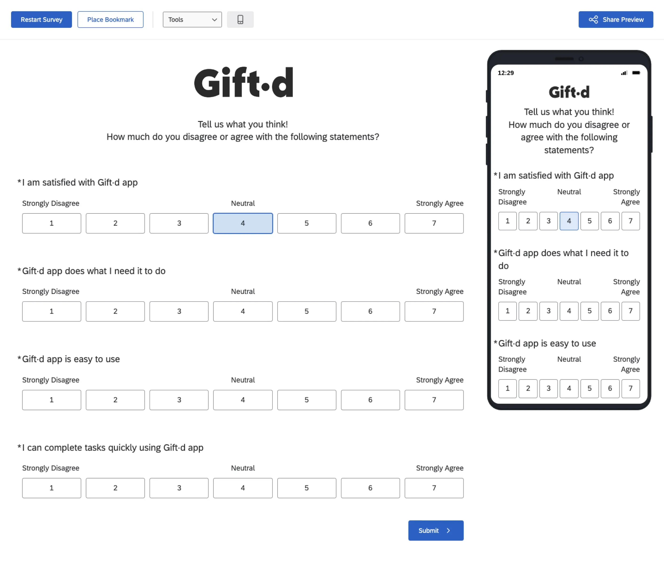
To ensure precise targeting, we leveraged Qualtrics' survey embed functionality. This method registers user ratings instantly upon interaction and seamlessly progresses respondents through the questionnaire.
To assess customer loyalty and satisfaction comprehensively, we implemented Net Promoter Score (NPS) surveys. This streamlined metric effectively gauges customers' likelihood to recommend our products or services, providing a clear indicator of overall sentiment.
The NPS methodology allows for strategic categorization of respondents into promoters, passives, and detractors. This segmentation facilitates rapid identification of brand advocates, potential churn risks, and areas requiring improvement. Following the initial NPS question, we incorporated a qualitative follow-up question to gather additional context and insights behind the given score. This approach enriches our understanding of user sentiment and provides valuable, actionable feedback.
The NPS survey's simplicity, combined with the added qualitative component, ensures high response rates while yielding deeper insights. This data drives targeted customer experience enhancements, fosters loyalty, and ultimately boosts growth and retention. Longitudinal NPS tracking, along with analysis of the qualitative responses, will enable us to monitor the impact of our initiatives and maintain a customer-centric focus in business decisions.


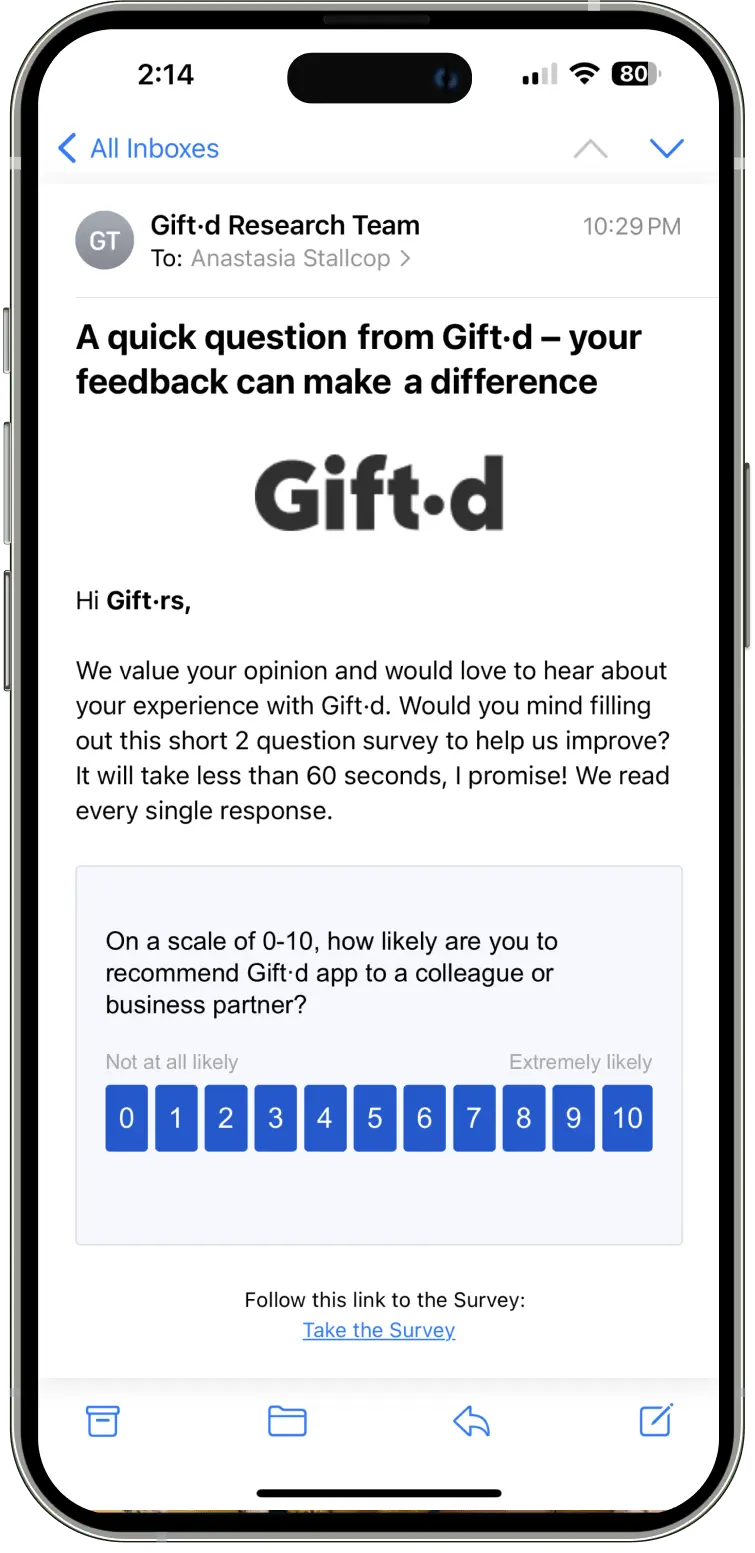
Our survey distribution strategy utilizes Qualtrics' embed functionality, instantly registering user ratings and progressing them through the questionnaire. By clearly communicating the expected survey duration, we aim to set accurate user expectations and maximize response rates.
Design Validation: Prior to development, we will focus on validating and refining new and updated features through comprehensive prototype testing, ensuring alignment with user needs and expectations.
Metrics Tracking Implementation: We will establish tracking mechanisms for the success metrics identified during the Google HEART workshop, enabling data-driven performance monitoring and optimization.
Future Research Planning: We will conduct a UXR planning workshop to define objectives for the next phase of research, including exploration of advanced feature requests such as A/B testing capabilities, sophisticated customer segmentation tools, and enhanced analytics functionalities.


.webp)